I began my scamps with a rough idea in my head to see where I could get to with pen and paper so I drew out a set of scamp ideas which I believed would work with the functions of the site. From them I thought the top right one was the most visually interesting and decided to play with that.

I drew it bigger with a bit more detail to help me visualise it and decided that the 'contact us' button in the bottom right seemed a bit out of place and placed it in the nag bar instead.
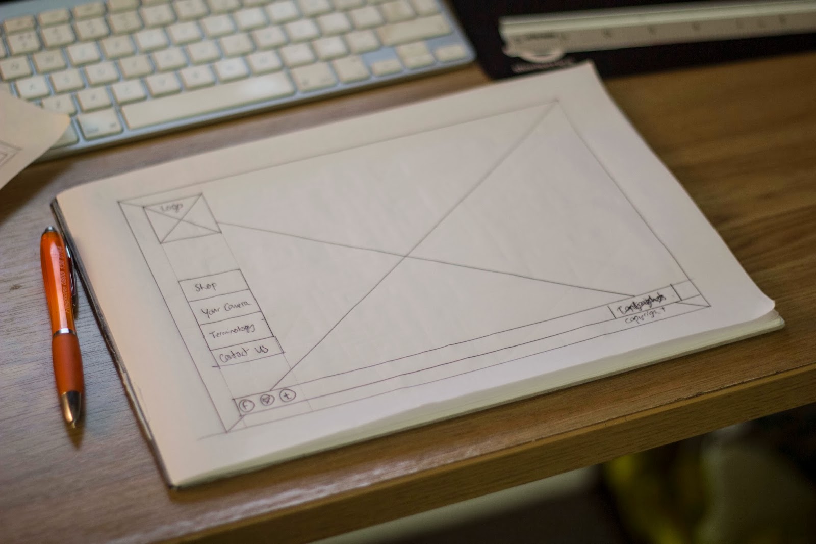
This appeared to work well visually as it was clear, simple, and easy to understand. Now I had my main layout to follow through the pages, I just had to have a good idea of what I had as my content on each page.

I drew out a series of thumbnails displaying my ideas for each page which I would work with to create it properly. These included each stage of the fitting product quiz, the terminology page, the shop page, product page, cart page and contact page.

I created my illustrator document in scale which would help my measurements in my wireframes after the digital design was finished.

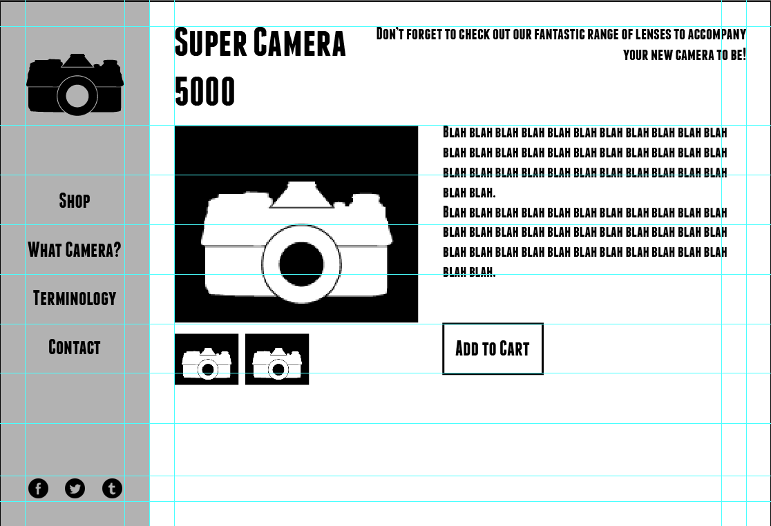
My grids were the first to go on the page to give me the foundation of my layout and content.


I realised after I had finished the homepage how much I disliked the logo with that typeface so I changed the logo which made it fit to my idea better.

Now I had a basic grid layout, a navigation bar and a content space to insert each page. Next was to finish the content design for each page that was needed.


After all of my design planning was finished I did the maths and built the wireframes to help me with the coding of the website.

Leave your comment