My first ideas were ranging from the mechanical process of a digital camera. They are all electric and mechanical functions which make it work as a piece of equipment. The general colour schemes for electricity are yellow and blue. I feel as though yellow would be too intense of a colour for a branding element of my website so I went on to consider the blue. Blue also came into motion with the idea of 'Temperature' in a photograph. This is normally considered when a photograph is in RAW mode in relation to blue and orange tints. Thinking further into this, blue means cold, and mechanical objects or parts are thought of as cold and heavy. The difference of a camera though, is that it is light, so maybe a tinge of green or a lighter blue will balance that feeling and make it feel a bit friendlier and less strong and intimidating.
I think that is enough of a thought-whirlwind to push me towards the idea of using a shade of blue in my branding.

The use of photographs on my website is unavoidable due to the content of it. To keep consistency in colour I would want to make the photographs either monotone or duotone with a darker colour for depth and details to still show in the photographs. I used my old site's background as an example to play with and decided that duo-toning the background with a light grey brought out the details but kept the colour's identity.

For typography I reflected on the critique I had just received and wanted a Header font and a Body font. For the Header font I wanted it to communicate clean, precise and mechanical features in a professional way and well structured way too to work with the clean aesthetics of the site as a whole. To begin with, it sounded impossible to find one but after a fair while I found the perfect example on TenDollarFonts called Ossature. Even though there was a price-tag on there, it was only £6 and it genuinely was perfect for what I wanted so I couldn't pass it up. This will be used in uppercase 43pt.

For my body copy I wanted something that worked well with the header with a clean and modern aesthetic but was far more readable in smaller point sizes. I chose Helvetica Bold 19pt because of it's simple and direct clarity in smaller point sizes complimented with legibility and readability too.

For my logo I wanted to keep it type based to keep it consistent with the website seeing as no illustrations would be used throughout it.
I made an art board at 200 x 200px and played with some ideas there.


I made an art board at 200 x 200px and played with some ideas there.
I much preferred the boxed logo to anything else, I feel it shows structural form a lot better with it's right-angles and measured margins.

For buttons, I planned them out to act almost 3D but I wanted it to have flat shading to make it functional, less corny than 3D but give off that illusion too. These would be in the branding colours to keep consistency.


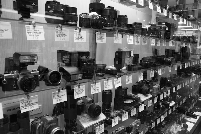
For my photographs I found some online of things related to the concept of each link.
What Camera?

Terminology.

Shop.
Contact.

To make all of these images fit nicely on the website I designed I first turned them all monochrome and then resized them to fit the 384 x 356px area.


After that I changed them duotone with the branding colours and the relevant piece of type was then placed over the top of these images to reveal what each linked to.


Next I needed a photo for the first page of the 'What Camera?' dialogue.

This photograph was then resized and edited as appropriate with information across it.

The body copy wasn't very legible so I scalped the photograph and settled for a flat background.


For each of the product banners at the end I used the same size box with a duotone image of the camera with the name and price.

The lens banner worked the same.

These were made for every camera and every lens involved in the 'What Camera?' dialogue answers.
For each product on the shop page I made an image 174 x 97 px to display a photo of the product as well as a rollover which shows the name and price too.


For buttons, I planned them out to act almost 3D but I wanted it to have flat shading to make it functional, less corny than 3D but give off that illusion too. These would be in the branding colours to keep consistency.


 |
| Non-Hover |
 |
| Hover |
What Camera?

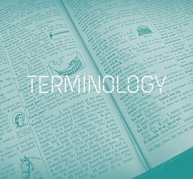
Terminology.

Shop.

Contact.
To make all of these images fit nicely on the website I designed I first turned them all monochrome and then resized them to fit the 384 x 356px area.
After that I changed them duotone with the branding colours and the relevant piece of type was then placed over the top of these images to reveal what each linked to.

This photograph was then resized and edited as appropriate with information across it.

The body copy wasn't very legible so I scalped the photograph and settled for a flat background.


For each of the product banners at the end I used the same size box with a duotone image of the camera with the name and price.

The lens banner worked the same.

These were made for every camera and every lens involved in the 'What Camera?' dialogue answers.
For each product on the shop page I made an image 174 x 97 px to display a photo of the product as well as a rollover which shows the name and price too.
Leave your comment