I wanted my layout and interface to match my new branding, smart, clean, mechanical and straight-forward.
I sketched out the idea of my homepage so it was very similar to my previous one but with a better spaced out navigation bar and a grid view on the home page with photography on it which would link to different pages.


After sketching it out I decided not to include the social networking buttons as I wasn't quite sure what the point of social networking would be with a site like this as it had a contact page.
I placed the buttons I created on illustrator onto a digitally made art board of the correct dimensions and scale to make sure everything worked together nicely.

My only thought was that the logo would be a link to the homepage so this should appear as a button too which was easily amended.


Now the design of the navigation bar was complete, I began work on the content area of the homepage by creating a grid of four equal sections and placed a square in each to represent a photograph.

Once the photos were found, resized and edited, they were then laid out into the designated spaces with one viewed as a rollover to give an idea what the site would look like in action. I really really liked the look of where this was going. It looked professional, clean, simple to navigate, mechanical and everything I was aiming for.
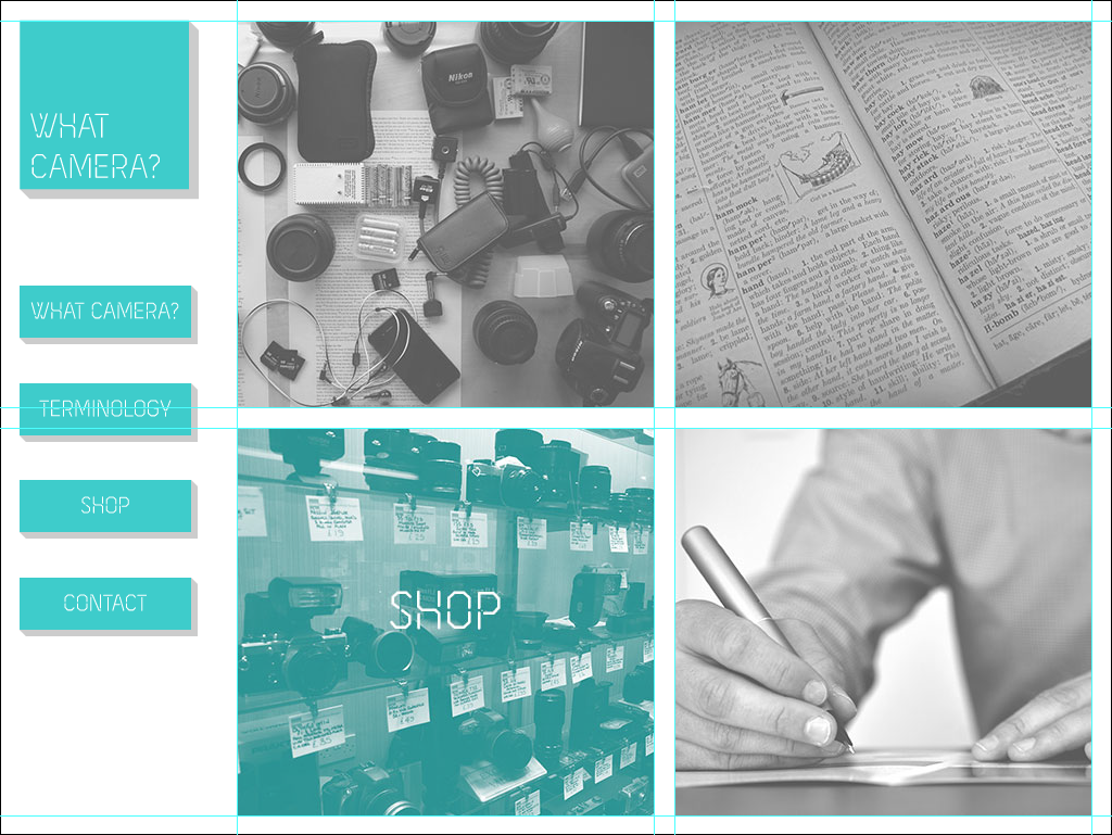

For the first page of the 'What Camera?' dialogue I used grids to lay out the photograph title and the buttons linking to the following pages, these grids derive as halves of the original content grid for consistency so will be used for the rest of the content pages.


I designed the recommended camera page in the same format but with the body copy on the left and two buttons on the right to help the audience navigate. The lens page would be exactly the same but with different buttons.

For the terminology page I made two content page's to cover the specialised vocabulary used.


For the contact page I designed it to all be left aligned with the submit button on the right.

Once the user clicked the submit button, they would be lead to a page which thanked for their efforts of contact and that they would get a response as soon as possible.

For the shop page I wanted everything to be laid out in a very tight grid which kept in consistency with the rest of the site. There was a total of 16 products which made things a lot easier as it would work out well with a 4 x 4 grid.

For the product pages I needed to include the product photo, the name, the price and the description with the ability to add the product to the cart. This needed to be reproduced for each product. This would also be as far as the website would go as I am not capable of coding the shopping cart page to be responsive with what the user selects.

This however will be designed anyway as a proposal.

Leave your comment