Archives

OUGD503 - Studio Brief 1 - Individual Practice - Nicole Jopek Photography

Nicole Jopek got in touch with me in need of a professional business card to help her create professional contacts and give the right impression to potential clients.

After a long discussion of her needs and wants and also figuring out that the client was going to be in a sense "fussy" over what she wanted made me see this as a good challenge for my creative practice to produce a body of work which excelled myself as well as representing the client perfectly.


Nicole studied graphic design at A-levels and in turn made her own logo:


Having this as her logo for so long made her very attached to it and when I asked her consideration for a developed logo and identity before she goes into the professional working world it took some persuading but after a couple of weeks she decided to take me up on the offer.


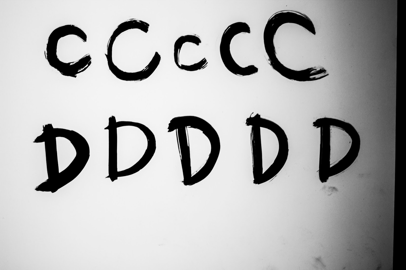
I worked at modifying a free typeface I found called CoCo, this typeface is very elegant and fashion orientated where it consists of curves and heavy stems.


Condensing the typeface to make it appear taller helped exaggerate the stems. I also created a capital N from it and sent it over but she said it wasn't her. Upon reflection I agreed and went back to the drawing board.


After researching into fashion and typography's connection, I discovered that Bodoni orientated typefaces are a direct link to each other in our perception. After looking at the licenses and their fees I decided to design my own.


As they all look so similar I wanted some kind of character thrown in without sparing any elegance in the letter-forms.


To do this, I followed a circular curve rule with huge contrasts between the thickest and thinnest parts of the letters. This with the removal of the N's stem created a beautiful typeface which I felt far more confident with presenting to the client.


Nicole fell in love with it instantly, which of course made me really happy as I had spent a few hours making sure each letterform was perfect.


Now I had a logo to work with, I needed to develop branding typefaces for my client to use with her work.


Bodoni would continue to be the grouping throughout so I decided on Bodoni FLF Regular & Medium Italic.


Having a typeface in place allowed me to create an alternative logo for when a landscape format or smallest size was not small enough. This was purely the N and J pushed together with the name below it.


To keep a balance and consistency in type and branding I will need to develop a series of branding guidelines to follow throughout all mediums:


The logo must have a minimum of a 10mm border at all times, no content can fall within this border.


The logo must be in black or white, whichever is more legible upon the background, the colour must not change. Tints are permitted with the logo however nothing below 60%.


The logo must never be changed or modified in any way.


When used in print the logo can not go any lower than a minimum of 34mm in width. This rule is in respect to the detail of the lettering and will not be effective at any lower size. There is no maximum size.


If the issue arises where the logo is too big to fit in the needed space, use the smaller alternative logo which can be used at a minimum of 16mm in width.


Titles must be in uppercase Bodoni FLF Regular, unless on the same line as body copy, in which case titles must be in Small Caps Bodoni FLF Regular. Point size must remain one point size above all subtitles and two point sizes above the body copy.


Subtitles must be in titlecase Bodoni FLF Medium Italic one point size below the title and one point size above the body copy.


Body copy must be in lowercase one point size below the subtitle / two point sizes below the title.


Typography can not go below 7pt, this will keep all related content legible.


Instead of the word 'and' an ampersand '&' must always be used.


No other colour can be used apart from black or white, this is determined by legibility and readability upon the background, if either are appropriate then the user may choose.


All typographic layout must remain aligned centre or if not appropriate, aligned left in the centre of the medium.


Now I have created some guidelines for legibility and consistency, I can follow these rules when designing the business cards and if needed, other collateral too.


Following the branding guidelines that were now in place, everything had to be aligned centrally as well as consistent with the typographic rules that were set.


The client's response was very positive and allowed us to discuss the production methods. Wanting a very high end quality of production for her cards, I discussed letterpress printing with her. After showing her a few examples she was very impressed and said it would be perfect for her.


I came up with the idea to have one side black and the other white, the black side to have the logo in glossy black foil and then on the white side have contact details in black ink. The stock would be duplex 700gsm colorplan. To help her understand what it would look like, I mocked it up with photoshop using embossing and gradient options to show shine.


Nicole loved what she saw and asked for a quotation on how much it would cost. I got in touch with a few printers but only two replied. The cheapest came to £305.40 for 100 or £367.80 for 250.


I placed an order for 250 business cards once Nicole had sent me the money for the work I completed for her and the cost of the print.


These arrived after the module deadline so I don't expect to be graded on them but just in case my work hadn't been seen yet I decided to upload pictures of them.


OUGD503 - Studio Brief 2 - Collaborative Practice - Final Boards & Submission

After spending two days planning and designing our final boards in a clear, simple and informative format we were ready to submit.


OUGD505 - Studio Brief 1 - Publication Final Crit

I mocked up my publication with the correct binding method, print method and stock to help people understand the quality and feel of it.


Some areas for improvement that were mentioned consisted of the following:

Sometimes feels like there is too much text - keep friendly and not too overwhelming!
Title on cover isn't clearly readable unless you look closely.

Some text repeats itself.

Try using dark green thread for the binding?

Consider the dark green theme for the packaging as well as its protective nature of the publication?


First I looked online in search for a supplier of green thread which would match the colour of my book, I sent an email to a website I found asking for a close matching pantone code for the green thread they had. If that was suitable I would buy that for my final publication.


I changed the front cover to make it more legible.


After speaking to several other people on the subject, a few said they liked the black thread more because otherwise there'd be too much green. This made me think it was entirely a subjective opinion and didn't need to be changed as it is functional and works with the design the same as if I had used green thread.

Finally, reading through the publication again I noticed where I'd repeated myself, however this was only if a further point was made or it was directly related to the topic itself. Several others believed this made sense and didn't see it as overwhelming, maybe because the people that gave me feedback were not my target audience, it just didn't add up.

OUGD503 - Studio Brief 1 - Uber Crit

We had our uber crit which covered all of the work we have completed for this module. First it was concentrated on the collaborative project me and Joe have been working on - Domino's and then moved onto the other work I have completed.

The people that sat down and saw our Domino's work said:


All positive a part from someones comment about the user interface, which we have tester ourselves and is fine so we agreed to ignore that one haha.

Next we got feedback on our personal work, my sheets said:


Overall I was very happy with the feedback I received. I will continue to amend and carry on with what is going well and if not, push further!

OUGD505 - Studio Brief 2 - The Brief


OUGD505 - Studio Brief 1 - Typography Workshop 2

How to kern:

Kerning is the spacing between a collection of letters. You must never negative kern, the spacing that already exists is there for legibility.

To kern a letter properly, you find the biggest gap between the letters and kern the other gaps to match it like I have done in the top word on this example.


Hierarchy:

Hierarchy is an important element in type design. This can be monitored or manipulated with point size, weight, capitalisation and kerning.

The challenge was to lay out four, three, two, one in that order but in a way that you read it backwards.

At first I presented the work like this:


And then I noticed that the word 'Two' had more spacing around the letters than other words and people would therefore read the word Two first, even though One was in uppercase and much bigger.


This succeeded in the test and everyone said it worked much better.


OUGD503 - Studio Brief 1 - Individual Practice - D&AD New Blood Awards - Purdey's Part 2

I broke my ring finger on my left hand which left me with no writing/drawing hand for five weeks. Progress was stalled until then.

When my finger was mended I got back to work on hand-rendered type and experimented with painting.


After I had painted a range of outcomes of each letter with the brush, I photographed them and edited them to black and white and with heavy contrast. These were then image traced in the exact same way as before.


With these letters, I recreated my previous design. This was far more successful and communicated the busy, rushed, energetic and lively values I was aiming to.


From the last crit I was also recommended to swap Rejuvenate and Purdey's as the hierarchy was wrong.


Once that design was completed I needed to come up with a similar motivational quote for the natural energy bottle.

Fresh air, green trees, blue skies, long walks. Feel good. Feel right.

Breathe, look, touch, create, experience. Feel good. Feel right.

I liked the second one best and felt it to be more relevant to the drink's name so I created the type.


When the design was on the bottle it felt very empty in comparison to the other bottle, I needed to add another line to make it work.

Breathe, look, touch, create, experience, do something. Feel good. Feel right.


To create the mockup I took the original Purdey's bottle and spent a while on photoshop turning it into the coating I wanted and then putting my design on it. This was done with each colour.


I also tried adding illustrations to see what it'd look like but it didn't work very well with the clean and rough type.


Once that was sorted out I got my design boards sorted out and designed to present my work to submit to D&AD.


This was then submitted and paid for.


Looking back over my work I really wish I gave myself more time to complete it and push it further. My broken finger for five weeks certainly didn't help me much with the manual elements but if I had an extra week or two I would of pushed it further with marketing campaigns and point of sale designs.
 

Copyright 2010. All rights reserved.