Archives

OUGD406 - InDesign Brief - Whales

For my InDesign brief I was given the animal 'Whale' to base my project on. To start off I went on a search for high resolution images to include in my work.

Obviously I haven't had the opportunity and still don't have the chance to go and take photos of different whales so I will have to work with stock images from online. This will be fine as it's not a real publication, however if it was, it'd have to be primary source photography or it would be infringing copyright.

The photos I found and were happy with were the following:


These would consist of two icon photos as well as a background photo. Now I have chosen the photos I have, I can now make some thumbnail designs to play with the layout consisting of the images, header, sub-header and body copy.

[photos of thumbnails]

The one I decided to go with was my favourite of the selection. To start it off I went into photoshop and made a document with the appropriate dimensions of the double page spread including the bleed.


I made some guides to fit the margin and borders, this will match my InDesign document when I set that up.


The photo was then laid into place as well as the header and sub-header for further editing.


For the editing of my image, I wanted the whale to seem as if it was swimming through the words to give it some more character and depth to the image. To do this I lowered the opacity of the type and erased parts of the letters as if the whale was in front of them.


Now my background image was made, it was time to create the InDesign document to lay out my double page spread. To set up the document, I made it so the dimensions were reflected on my brief, but halved the width as I was making it two pages wide. I also added 3mm bleed and 12.7mm margins to reflect my background file. 3 pages were made because the first page is always a single page.


It was then time to display my body copy and my other two images into the four columns. The body copy involved was the following:


"Like most animal groups, whales have subcategories and an enormous range of species within them. In fact, “whale” is the english definition for a variety of different marine based mammals under the name ‘Cetacea’.

The two main categories of whales are ‘Odontoceti’ which consists of mammals such as killer whales, beluga whales, pilot whales and sperm whales. And the other is referred to as ‘Mysticeti’, this subgrouping consists of the whales which feed via a thin comb-like filter in their mouth called baleen which can catch small organisms such as plankton and other marine bacteria. Recognisable names of whales in this subgroup are the humpback whale, the minke whale, the bowhead whale and the blue whale.

Whales have a massive variation of different shapes and sizes but are almost always thought of for their giant structures, iconic examples of different sizes though would be the blue whale and pygmy sperm whale, with a huge difference between them.

The blue whale is the biggest mammal to of ever existed on this planet and is still exploring the deep blue to this day. This incredible whale lives at an expansive 30 metres in length and a minimum of 170 tonnes in weight. On the other side of the spectrum, the pygmy sperm whale isn’t much larger than your average dolphin at about 3.5 metres in length and weighs around 400 kilograms.


The reason that whales can grow to such enormous sizes are because their body mass is supported by water, if they grew to their size and lived on land, unlike mammals that live on land that have strong hard bones, whales have a very soft porous bone structure used to store food supplies in a form of oil, their body would collapse.


Another reason they are so massive is because they travel in cold and icy waters. Their whole body is covered in a very thick layer of blubber which is used as a vital insulation as well as energy reserves, this keeps their bodies at safe temperature and allows them to store up on food when travelling long distances.

A common mistake is that whales do not have gills, and cannot breathe under water. Instead they come up to the surface to breathe air, air is breathed in and out throw a hole in the top of their body near the back of their head called a “blowhole”. Sometimes a whale will come up to the surface to blow out a big shot of air, this often creates a fountain of watery mist, this is called a “blow”. When they sleep they float on the surface with the blowhole above the water whilst they rest.


Here are some interesting facts about whales which you might not of heard before which can be found below:

It has been calculated that a single breath from a mature whale can inflate up to 2000 balloons.

Most elephants weigh less than a blue whale’s tongue.

Whales live in large groups which are called “herds” and a baby whale is called a “calf”.

The heart of a blue whale is the size of a Volkswagen Beatle.

Baby whales grow at an average weight of 10lbs an hour!"

First I cropped the photos I was using into the right size to then place as an anchored file in my text box. This would make everything easier in layout as the photos would move with the text.


And there it was finished! Last thing I needed to do was print it.

OUGD404 - Design Principles - Visual Literacy - Grids and Layout

Fibonacci Sequence:

Fibonacci Sequence is all consisting of ratios.


The sequence of numbers used in the fibonacci sequence are:

0 + 1 = 1
1 + 1 = 2
1 + 2 = 3
2 + 3 = 5
3 + 5 = 8
4 + 8 = 13

The proportions work as twos, each one then combines what is already there.

Titling - Headers and Subheaders:

24 point title should be
complemented with 18 point body copy by applying the fibonacci sequence.

Golden Section:

The division of a whole for layout.
About achieving balance in designs. Used since Ancient Egypt and the Greek Empire. 
The golden number is 1.62 - if using custom paper sizes [ divide length by 1.62 to achieve width ]


Rule Of Thirds:

Equal proportions, governs the points of interest of an image, mostly in photography. The image is divided into thirds vertically and horizontally. You can then chop those thirds of each angle into more thirds. Eyes work with the brain in a lazy way and naturally fall into certain places such as the thirds.

It also works on websites, logos are usually placed on the top left or middle centre as that is where the eyes fall. A photo or header is then placed in a central location where your eye falls next. A form of breadcrumbs are then placed to lead your eye onto other sections of the publication or website to take in more information and gain interest in more content. 


Task: Create a custom page layout with the Fibonacci rule but with a beginning box with off sides.

I made my own layout by starting with a box diameter of 0.5cm width and 1.0cm height. I then built this up on illustrator on an A3 scale until I couldn't fit anymore.


Made a pretty interesting layout and size to work from in the next tasks.

Canons and Grids:

Van De Graaf - Creator of the canon.

Grids are like scaffolding for a building. It is necessary to keep everything built, straight and in form.

The Van De Graaf canon is a historical reconstruction of a method that may have been used to divide a book in pleasing proportions. This canon is also known as the secret canon used in many medieval manuscripts.

The construction of the Van De Graaf canon works for any page width-height ratio.


Leading:

Column width more than just design and format. It is also legibility.

There is a rule that you shouldn't use more than 7 words per line but that is dependent on the information and body copy you have to work with.

It is the vertical distance between the lines of text which suits the point size of the type.

Overlong text lines do tire the eye, there is too much energy spent keeping the line in an eye completely horizontal.

Margin Proportions:

Margins are a derivative of columns, they influence the whole feel of a print. 

If they are too small, the content looks over full. If they are too large, the content looks exaggerated.

Margins generate the impression of indecision and dullness.

The Type Area:

The best division is to split into two columns.

In the next session we were asked to create our own layouts on a big piece of paper after experimenting with sections of different magazines.


We were also asked to create these layouts in InDesign for the next time we were back, so I got cracking on that. This was great practice for InDesign and I already feel I am more confident with the software.


Construction of Grids:

When you design grids you need to design a selection of different thumbnail layouts to make sure you are using the best format. Don't just made a select few, make a big selection and then as you narrow yourself down eel making them bigger so you can see what you can work with. You must consider the publication, is it going to be a lot of text or is it going to be heavy on images? Never restrict yourself to one column, always use at least two but three is also good.

You can also subdivide columns if necessary. This can be useful in use of figures and statistics when presenting data in a legible way. For it to work small and legible typefaces must be used or it will be completely useless.

For these kinds of publications it's recommended to use four columns to lay out your pages for convenience of laying out statistics.

Font Heights:

Use fibonacci sequence for the best results.

Type and Image:

On A4 format pages, you can use either 8 or 20 grid fields. Advertising uses 8 grid fields mostly which can be subdivided into 16.

If the line of text fits perfectly in the gutters you have the right point size for the page. You must have a good perception of composition.

"The grid is an instrument in which, you a designer, creates interesting and balanced designs with type and image."

20 field grids are the best to begin with and then you can experiment with different layouts and grid markings. 

OUGD406 - Design Practice 1 - Design Is About Doing

Live Brief: Secret 7"

After we got our brief I went onto the Secret 7" website to gather some more information on what we needed to do.


I had a listen to the songs on selection for the brief and I decided I wanted to select the song which I enjoyed listening to the most. This came to be Public Enemy - Harder Than You Think, which I have embedded below:


I decided I needed to get into the habit of listening to the song to both get into the mindset of the brief, capture the whole feeling of the song, and also get pumped for the design process. I have a habit of listening to music which is related to my brief because it influences my decision making as well as my overall design outcome.

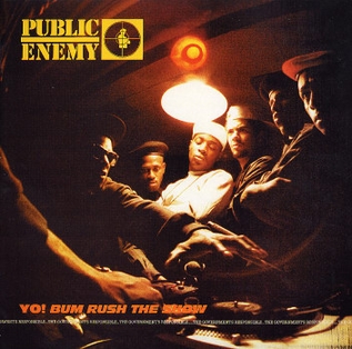
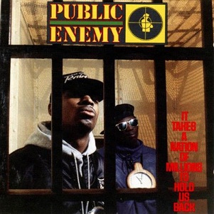
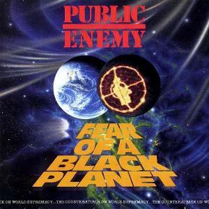
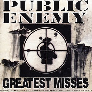
My next research direction was to look at their past cover art work from previous albums and singles. Below I have showed the ones which I found, these will influence me in one way or another.


Yo! Bum Rush The Show - 1987
It Takes A Nation Of Millions To Hold Us Back - 1988
Fear Of A Black Planet - 1990
Apocalypse 91... The Enemy Strikes Back
Greatest Misses - 1992
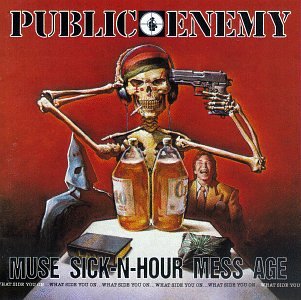
Muse Sick-N-Hour Mess Age - 1994
He Got Game - 1998
There's A Poison Goin' On - 1999
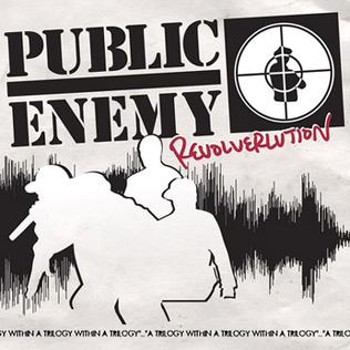
Revolverlution - 2002
New Whirl Odor - 2005
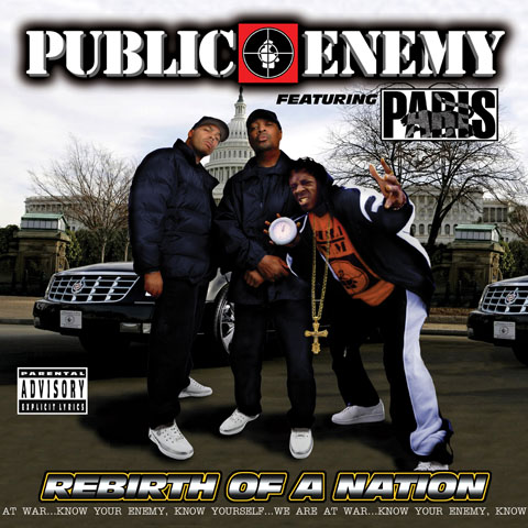
Rebirth Of A Nation - 2005
How You Sell Soul - 2007
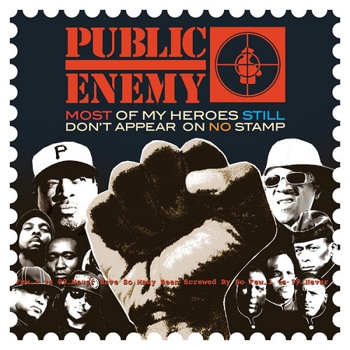
Most Of My Heroes - 2012


The Evil Empire Of Everything - 2012
After looking at the evolution of Public Enemy's cover art, a quality of design work increases as the years go on dramatically, I feel the artwork for 'The Evil Empire Of Everything' goes back a notch though. However the rest have an obvious increase in thought and quality.

None of their album artwork inspired me much apart from the 2012 album 'Most Of My Heroes' which had some interesting aesthetics which relate to the album name and message. The rest seemed too 'gangster' and 'black cultured' involving just photos of them all in a group with an upwards camera angle looking very 'tough'.


I wanted to see examples of last years work and what came of it so I looked for more information, I found this youtube video showcasing the final event for the 2012 competition and it really inspired me, it also got me interested in actually going to this year's exhibition day.


I also wanted to see examples of different record sleeve designs and found a blog post on creative review about the best record sleeves designed in the month of November 2012. Ones I particularly liked were these:


Obviously we are not allowed to use type in any way according to the rules of our brief so I am going to have to avoid this at all costs.


Lyrics to the song which I have chosen are as follows:

What goes on?
Rollin stones of the rap game not braggin
Lips bigger than jagger , not saggin 
Spell it backwards
Im a leave it at that..

That aint got nothin to do with rap
Check the facts expose those cats
Who pose as heros and take advantage of blacks
Your governments gangster so cut the crap
A war goin on so where you at?

Fight the power comes great responsiblity
F the police but whos stoppin you from killin me?
Disasters , fiascos over a loop by pe
If its an i instead of we
Believin tv
Spittin riches , bitches, and this new thing about snitches
Watch them asses move the masses switches
System dissed them but barely missed her
My soul intention to save my brothers and sisters

Get up
Hard...just like that
Get up
Hard...just like that
Get up
Hard...just like that
Get up
Hard...just like that

[verse 2]
Screamin gangsta 20 years later
Of course endorsed while consciousness faded
New generations believing them fables
Gangster boogie on two turntables

Show no love so its easy to hate it
Desecrated while the coroner waited
Any given sunday so where yall rate it?
Wit slavery, lynching , and them drugs infiltrated

Im like that doll chuckie , baby
Keep comin back to live love life like i'm crazy
Keep it movin risin to the top 
Doug fresh clean livin you dont stop

Revolution means change
Dont look at me strange
So i cant repeat what other rappers be sayin
You dont stand for something
You fall for anything
Harder than you think
Its a beautiful thing

Get up
Hard...just like that
Get up
Hard...just like that
Get up
Hard...just like that
Get up
Hard...just like that

[verse 3]
So its time to leave you a preview 
So you too can review what we do
20 years in this business
How you sell sell soul, g wiz
People bear witness
Thank you for lettin us be ourself
So dont mind me if i repeat myself
These simple lines be good for your health
To keep them crime rhymes on the shelf
Live life love like you just dont care 
5000 leaders never scared
Bring the noise its the moment they fear
Get up still a beautiful idea

Get up
Throw yo hands in the air
Get up show no fear
Get up if yall really care
Pe 20 years 
Now get up

Get up
Hard...just like that
Get up
Hard...just like that
Get up
Hard...just like that
Get up
Hard...just like that


I found an article on the song which described it, criticised it and praised it perfectly.


“Harder Than You Think” is the kind of epic statement that few have ever done better than Public Enemy, a blast of sound and lyric that links the chains of tradition into an unstoppably powerful force.  The track also consciously asserts P.E.’s continuing, though changing, importance in the larger conversation: That “Harder Than You Think” opens with Flav’s reprise of his signature introduction to the group’s early single “Public Enemy #1” is only the most obvious moment of recall.  The guitars which guide this spare beginning gives way to the deep swell of a full R&B horn section, whose triumphant herald provides perfect support for one of Chuck D’s most intense recent performances. Unlike many of his “conscious” contemporaries and followers, Chuck’s always understood that the most intellectually or politically aware lyrics will mean nothing if they’re not accompanied by an accordingly memorable backing track, and—while he hasn’t always succeeded in this regard—“Harder Than You Think” sounds like it can move mountains.
Despite Chuck’s thunderous, relentless flow, the song’s chorus contains nothing but the horns and Flavor Flav’s stabbing repetitions of “just like that,” a piecing combination that—if only temporarily—washes away every memory of Flav’s ignominious reality-TV career: The Greatest Hype Man In The World once again frees himself from the Tar Baby, and summons the spirits.
The lyric itself is certainly of a piece with the glut of admonitions that P.E. and others have made a staple element of their recorded output, but it accomplishes something slightly different, and more valuable: Chuck’s verses primarily criticize rap and rappers for not being willing or able to grow up, instead staying bound to the styles and symbols that the genre’s been selling (and white folks have been buying) for two decades. While we could certainly debate the degree to which this accusation is simplistic, the arrested cultural development observed by Chuck D has been on the minds of plenty of folks, young and old, throughout the hip-hop nation in the past few years: Nas, whose debut album came out after Public Enemy’s great period was over, even declared hip-hop “dead” in his compelling 2006 single, but the older, wiser Chuck D isn’t willing to give up the ghost just yet.  Instead, he argues that the strength which hip-hop always possessed, and must continue to exhibit, comes through mature recognition, a quality which (like PE, and hip-hop itself) remains “harder than you think,” the double meaning of which, Chuck points out, “is a beautiful thing.”
It is a truly remarkable recording, the best Public Enemy track since the golden era. It captures their musical scope and lyrical precision in a way that some have forgotten, and many more have sadly never experienced.  (While I’m not gonna pretend that it’ll be a hit, I know that I can slip “Harder Than You Think” into the mix with Kanye West, Lil Wayne or the other true-funk soldiers who currently populate the charts much more easily than I could 99% of the current crop of “conscious” rap.)  This is a work of immense proportions, in many ways a corollary to Johnny Cash’s stunning reading of “Hurt,” in which PE similarly confronts the weight of continuing, complicated struggle.  Unlike Cash’s existential gravity, though, Chuck D, Flavor Flav and comrades tap into still-deep reservoirs of (Black) power to ready themselves, and their spiritual sons and daughters, for the coming fight.  Many in hip-hop’s first generation try to stay young, and wind up looking older than they ever should have feared.  Public Enemy, rather, is celebrating their maturity, and manages to sound younger than they have in years.


This song is basically a representation of their career and success, inspiring to work hard at what you love and proving that they worked hard to get where they are. An amazing song all in all through meaning and music, and I am not a hip-hop fan whatsoever.


Now I have studied the meaning of the song, the group and it's history, I feel ready to start on my thumbnail ideas for the record sleeve design.


After completing my thumbnail ideas on my design sheets I had a selection of favourites I wanted to work into. But one in particular I absolutely loved. This consisted of the face of Flavor Flav illustrated and built up into different sections to represent the years of hard work they put into their music to get themselves where they are today - which is what the song has a meaning of.


I was pretty happy with the sketch I did with the pursed lips, raybans and slanted cap and so I decided to overline it with fine liner correcting my sketch as I went along. I got really into it and forgot to take a photo of it before the fine liner but this is the piece.

After it was sketched out I put it into illustrator, vector traced it, corrected that again and added my colours.


I wanted to make a second variation with the other primary member of the group to see if it worked any better, the process follows below:


After finishing it and comparing it to my previous one, I wasn't as happy with it as the first so I decided to just keep to the first. When it was submitted, I ended up with 701 submission views and became 11th place in votes in the category which I was dead proud of.


Sadly they didn't get back to me so it wont get printed, however I was proud to see friends on the course get selected in help of the cause.


Copyright 2010. All rights reserved.