When working in InDesign, if any columns or margins or bleed need to be changed during the process, this can be done with clicking File > Document Setup.

Layout > Margins and Columns.

Colour in InDesign is works in exactly the same as in Illustrator with the swatches and colour pallets.

When working with text, it works exactly the same apart from a new option for the type.

Just like Illustrator, when using the drop down options, you can find the create a new swatch option so we can be more exact with ink mixtures.

The colour mode drop down menu can be used to find pantone colours and unique reference colours from different swatches.

To create a new tint swatch, the drop down menu in the swatches menu can be used to change a spot colour to a different tint.


When working in Photoshop to put into InDesign for print, the following things must be considered:
- Make sure the colour mode is set to CMYK before it is saved.
- Make sure the size of the image is the actual size of what you need it to be.
- Make sure the resolution is 300dpi.
- Make sure the format is appropriate. PSD if using transparency, TIFF if not.
When working in Illustrator to put into InDesign for print, the following things must be considered:
- Make sure the colour mode is set to CMYK before it is saved.
- Make sure the format is an AI file to remain a vector.
- You can copy and paste a vector into InDesign.
When a image which uses customised spot colours is placed in InDesign, the colour palette travels with it. This is useful for using the same colours consistently with ease.

How to get from our InDesign layout to our finished print.
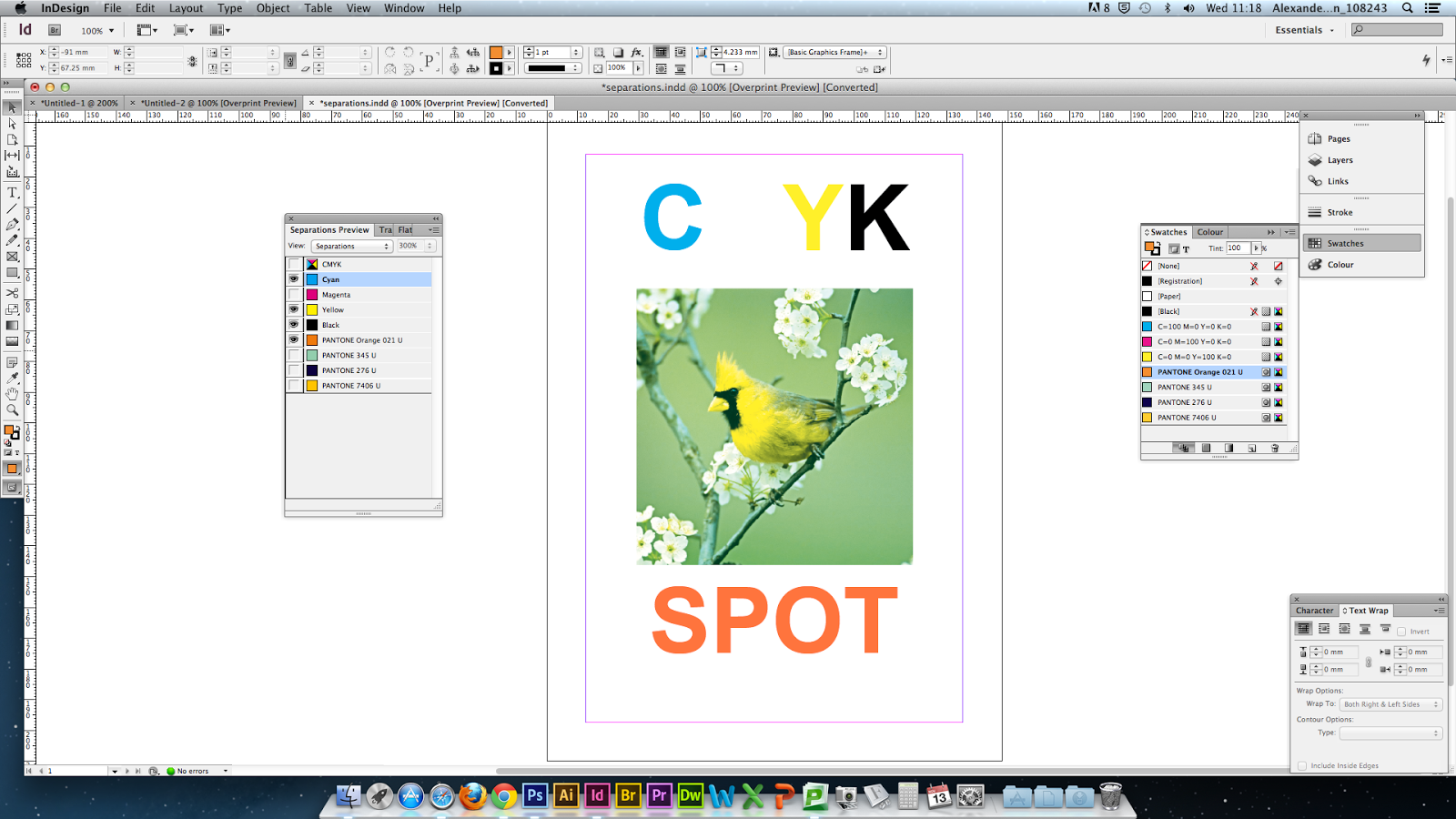
Colour Separation:
For a CMYK print, we would get four print-outs. One for each colour. From each one of those, a plate/screen would be made to print each colour.

When this is turned on, the overprint preview automatically appears to make the image sharper.

When each colour is isolated, you can see in the preview the part of the image which will be black.


40-65 lpi is best for screen printing.
commercial printing is between 120-170 lpi.
Moiré patterns are when two grids overlay each other.
To set a document up in indesign for overprint, you open the attributes window.


Leave your comment