
We then had to choose one of the subject areas to do some in depth research upon, out of the ideas discussed, I chose the commercial aspects of transport.
The commercial aspects of transport list such as: Businesses who run public transport, industries who depend on transport, companies that sell methods of transport and companies who sell services of transport.
First I made another spider diagram to highlight my ideas and where they could lead, this also gave me a starting point to plan what to do. After my diagram, I listed my primary and secondary research ideas to give me a guide on what to try next.

For our crit this week, we need to present three A3 art direction boards to express our research in a visually graphic way. Each are separate forms of research, ie Primary research, Secondary research and then one for whichever route we plan on developing further.
My first task I am setting myself is to venture into leeds after my Lecture and take photos of appropriate scenes and related themes - this will let me develop further into drawing and then theoretical investigation research.
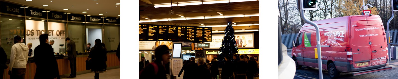
I left uni with my camera equipment: a Canon EOS 450D backed up with a 50mm f/1.8 and a 18-55mm f/3.5 lens. Every opportunity I got I took a photo which could be relevant to my project, I headed down through leeds and towards the bus station, where I found a multi story car park with an open top roof, I then ventured to the train station to finish my photos before heading home.
When I went into the bus station, I decided to pop into the information centre and pick up anything that could come in useful for my secondary research in the pamphlet stand. I picked up a variety of different timetables and information brochures on pricing and transport via buses in the area.

When I got home I put all of my photos onto my computer and checked I had all the exposures right, some of them were incorrect so I adjusted them in the RAW settings. Other than that, I was very happy with my outcomes. Here's what I captured.


Now according to the information booklets I picked up, transport costs follow like this:
Children under 5 - Travel free
5-10 year olds - Pay half fare on buses and trains.
11-16 year olds with a young persons photo card - pay half fare on buses and trains.
16-18 year olds with a scholars photo card - pay half fare on buses and trains.
For anyone under 22 with a student plus metro card - can buy weekly or monthly ticket £19.20 a week or £72.90 a month.

(information received from leaflets and http://www.wymetro.com/TicketsAndPasses/YoungPeople)
Now in my personal opinion, most of those prices are very justified and are very appropriate. But the student plus metro card is an absolute joke. Students are generally extremely poor and living off baked beans on toast. How this company charge £72.90 a month to a student and get away with it I have no idea, if anything they have even less money than when they were at college or school as they are now independent (I for one was better off then)
I take regular public transport as I maintain a part time job out of the area. And because I can't afford to get a student pass, I need to pay £4.00 a day just to get to and from work, this works out at almost £50 a month.
I decided in my anger of discovering this information to illustrate what I thought of them.

I began by drawing out a corporate suit on illustrator to communicate the formality/business side of the image. It also represents a higher class, wealth and the height in the social scale. This took a lot longer than it should of because I changed my mind a lot on how to draw it, I did have my previous screenshots of the process but sadly they were accidentally overwritten.


After layering up all of the tones to add depth to my image I thought of a way to relate it back to the corporate owners of these public transport businesses, and it was simple but effective. But also so subtle it could be perceived as many things, perception has always been an interest of mine. This can show a business man who spends a fortune getting to work every day, it could show the extensive profits of chairmans of these companies and I am sure many other ideas could be produced from this subtle illustration. There's a lack of identity for a reason, and that is to make it a generalised piece of work.

I tried to think of an appropriate way of drawing this photo and I came to the decision to trace it on photoshop with a very small brush tool, making it quick and messy. This would communicate the idea of speed, rushing, messy but also delivery. I will effectively be delivering an idea or message through image as if it was being "transported".
I started off with the delivery man in quite a lot of detail as this is the most important part of the image.

I slowly built it up more and more until the image was completely sketched out. The effect I aimed to achieve was successful but it felt quite empty as a piece just black and white.


To solve this problem I chose to block colour aspects of the image in the most effective colour in the original photo: the orange on the man's uniform and van, identifying them as a brand/company. I did this yet again quickly and with no accuracy to give it that rushed feel as it misses bits and goes out of the lines in others.


I really liked how this came out and turned it into quite and effective piece but the orange was too powerful and so I lowered the opacity so that it was only complimenting the line-work. This worked perfectly to what I wanted.

I opened photoshop and laid out my favourite and most relevant photos down the left hand side and one on the right of the A3 art board. I decided to make them black and white because there was so much colour going on it was a bit too mad, it also made it feel a bit more corporate and cold like the theme I am researching.

Next I placed my most recent drawing in the bottom hand corner to fill up the space as well as contrasting the block solid texture, I also made this monochrome to fit the photos better.

I was really liking the composition I was building up because I hadn't really done anything like it, the next thing I did was bring the suit I drew into it, however because of all of the detail and block colouring, it just didn't fit with the piece.
I played around with the positioning of it, until realising if I got rid of the colour that I added, I could stylise it in the format I am currently working in. After that, I removed sections of it and changed some into white resulting into this:

Finally, the last thing to add was the type! I went through my font book and found the perfect corporate, professional looking header font I bought on tendollarfonts.com a while ago 'Hermina'. After positioning my type I decided it didn't fit properly and I still had space to fill, and so I layered the type to make it combine and turn into an arrow too. And there is my primary research art direction board:

The next task to complete is my art direction board for secondary research. This was really hard to research as most of the information i was trying to collect was confidential finance information through businesses who would not be willing to share such details in case of competitors.
However I did find one website which showed me some statistics which I wrote down, however something happened to my computer as I found it and safari closed all tabs and history of the day. After a couple of hours or searching for it, I couldn't find the website anywhere to find more info or use as a reference.
Even though I lost the best information source I found, I used it anyway from what I wrote down. Statistics it provided were that from given surveys listed to the random general public, 96% of people depended on transport for their day to day lives, and 98.5% of people depended on transport for their businesses or companies.
This alone tells you the importance of transport in industry and commercial activities as a whole. Pretty much everyone relies on it to get to places where they can shop or spend money, and even more percentage of businesses or companies rely on it to function for clients.
Another section of info I wrote down was that out of all of the people who use public transport, out of all of the people who use buses or trains, half of them use the other as well. This gave me a good idea of the relation between the two for people's general use either to get to work, school or for leisure.
As this was the only information I could find which was generally useful to my understanding of my theme, I wanted to show this visually on my secondary research art direction board along with the information about the prices of public transport for young people.
I began with the same layout as my previous art board to keep it consistent with composition and use of type by keeping the title the same but laying a photo I took of the visual information I collected, in monochrome to fit with my previous board.

Next, I used illustrator to create a set of people small to big to visually back up the information on my youth transport fees. I set these on the left hand side to balance the composition whilst having them just on top of the photograph to make it appear as if they were stood on top of it.

To lay out the information creatively, I created guided lines leading to the designated, appropriate sentence for each age group.

To fill the space below the text, I set out two pie diagrams I created in Illustrator labelling each appropriately. This is a visual way of setting out and communicating the message I wanted to. To compliment the idea of transport, i followed the pattern layout of the previous art board and guided an arrow through the 'f' and 'l' of the header type.

To follow through the theme of visually communicating a statistic, I did the same for the public transport statistics too. To do this, my idea was to have two circles with low opacity crossing over each other and creating a space within itself to signify the half of people that use both forms of transport. This also clearly identifies a link between the two forms of transport.

After looking over it a bit more, I decided the use of black type within each circle was affecting the impact of the header type. For this reason I tried changing the colour to white and I much preferred it and had finished my secondary research art direction board.

Finally my last board will be the direction in which I want to head with my research. After my extensive development, a lot of thought and my experiences from taking in what I have seen when out; I have noticed an extensive use of advertisement for use in the medium of transport.
This is quite a broad, widespread area of research but i am thoroughly interested in the use of advertisement in different mediums and surroundings. Millions of people are constantly using transport in some way or form at every moment of every day and it is the perfect time to bombard people with thoughts or feelings towards services or products.
If my investigation and research goes any further, I will want to focus solely on advertisement through transport. This could range between bus stations, train stations, bus stops, on trains, on buses, billboards, large scale posters, transport flyers, leaflets, brochures, etc.
To focus this into an art direction board I will use a combination of photography and type. I will lay this out in the same compositional layout skills as my other two boards but in this case I will be including body copy to express my thoughts, ideas and plans.
The first thing I did was lay the type in the exact same place as the other two to keep it consistent and then move the arrow to frame the right side of the board and along the bottom.

The next thing I did is lay the photos on the same side, creating an effective mass of negative space where I could position my body copy to link the header and the imagery.

Then finally the body copy was added to my piece to finish it off. This consisted of a title, body and conclusion of my thoughts and ideas.

And that is the end of my primary research, secondary research and following direction brief to prepare for the next stage in our module.
Leave your comment