| Task |
Using the principles, processes and resources introduced in the first four studio sessions develop a series of practical investigations into the development of new letterforms and fonts.
The Process - Use the individual anatomical elements of your chosen fonts (Gothic, Roman, Block, Script) to
create a range of possible new letterforms.
1 - Cut the individual elements out and re-construct them in order to create a series of Hybrid letter-forms.
2 - Select the 5 most successful/interesting/legible letterforms and produce the uppercase and lowercase Aa, Bb,
and Cc
3 - Trace these off and hand render them.
4 - Using the same approach to hybridising create the appropriate upper case Xx, Yy and Zz for each of the 5
new fonts.
5 - Name each Font
It is important that you work systematically and logically through this task as your decision need to be repeatable
on new letterforms.
Repeat, repeat, Repeat again
|


This was a long and difficult process, I had never really used a scalpel before so I decided I better start practicing with this exercise. It became easier and easier the more I did and as I went along I found certain techniques working better and easier than others for both straight lines and curves.
The first letters I began dissecting was the uppercase A's of all my fonts, until I went onto the uppercase B, and lowercase a and b.

Grouping up the sections of letters was a really good idea because it helped me later on organise them in an efficient way of combining them together to create different letterforms.
The first letter I grouped up and mixed up the elements for was the uppercase A. The three groups of parts of the letter were the two stems and the crossbar. I combined them in every possible way and documented it as I went along with photos. Here are all of the combinations of elements to make an uppercase A:

Throughout this process I created some very interesting hybrid letter-forms which I was very happy with and was quite intrigued with the end pieces, and I also created some bad ones which definitely won't be developed any further. I will go back to this when I work out which letters made were the most interesting.
The next series of letters I put together were the different typefaces of an uppercase 'B'. The parts of this letter consisted of a stem like my 'A' and two bowls stood on top of each other. Here are all of the possible combinations which I created:

I then worked my way through the lower-case a's and b's. There were very hard for an amateur cutter because of all of the curves, they weren't very accurate but they were good enough to work from.


There were only two type elements of each of these letter-forms so this was done moderately quickly in comparison to the uppercase letters. Due to the nature of them, the bowls were the hardest to cut because of their thin curves but after getting them all cut and categorised, I began combining them. One thing I did find was that the lower-case letters didn't maintain their form as easily as the uppercase ones. This will be to do with the fact the counters of the letters are in a smaller space and therefore harder to identify, when messing around with different styles and widths in one letter, it is bound to change its legibility for either the better or worse.
Next I will select which five letters I created were the most interesting and then develop them into a typeface of ABCXYZ abcxyz.
The five hybrid letterforms I chose were the following:


After choosing my five hybrid letterforms I divided up my fonts to give me a clear view of the letters I had to work with.

After I had split them all up and had them all organised, I decided to start combining the letterform elements together to make my font combinations. My first set was made of a gothic bowl and a block stem.

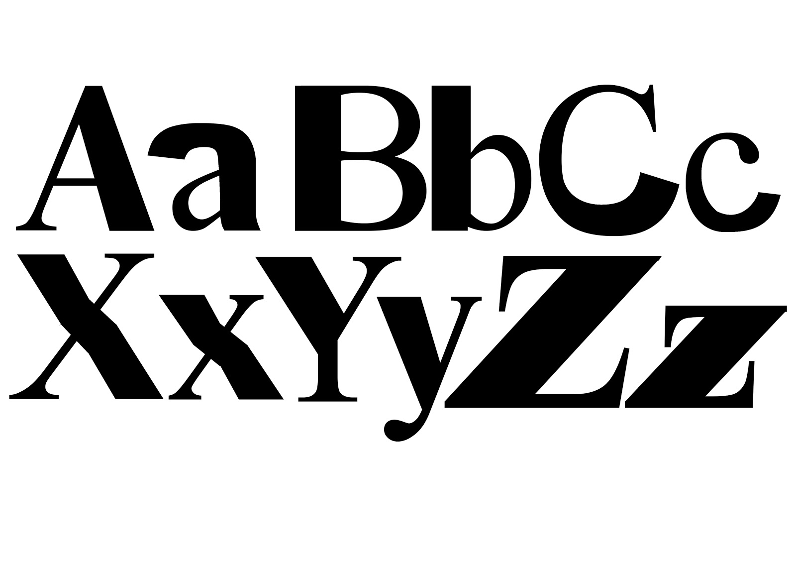


After building each letterform digitally, I printed them out and traced each one individually correcting edges and bumps by hand rendering them. These are my finished typefaces:
Ariel Block

Times New Ariel Bold

Ariel Block Bars

Times New Brush Script

Brush Ariel Block

Leave your comment