Alphabet Soup: Illustrator - OUGD403

In our Illustrator workshop session with Simon, we were taught how to use the pen tool, one of the most beneficial skills in Graphic Design and also something I didn't really have any experience in.
We started off with an exercise sheet which taught us all the main uses of the pen tool and how to manage them.

The first exercise was to trace a star shape, each point had an instruction to help us learn the fundamental ways of using the pen tool.


I went through the excercises practicing the skills learned from simon and the activity sheet and managed to finish them pretty quickly.


The hardest part of all of them was the last excercise which was a strange shape with curves, it definitely took the longest but I was pretty happy when I'd finished it!


...................................................................................................................................................................

So after I had practiced using the pen tool I put it to use on tracing a letter which Simon provided. After tracing it and seeing how wonky the lines are, it showed just how much practice I needed to do to get things right for my actual typeface!


In it's place, I attempted forming this "g" by creating circles and then joining lines and removing them to form the shape till it was reproduced but with no jagged lines.


Finally I am ready to begin using illustrator to create my own typeface based on my theme of 'extract'. My favourite letter I did out of the ten was the letter 'a' so that is where i started.

After tracingmy letter from the original drawing, there were aspects of it which weren't right like the circle patterns inside the shape so what I did was a made new circles with the shape tool and it looked a lot better.


I used the widening tool to make slight adjustments and then it was finished!


.................................................................................

For the rest of the alphabet I decided I was going to draw each letter out in pencil and then later on scan  them all in and slowly perfect them on illustrator this will be time consuming but I think that it'll be worth it with the end result!


The next part of my process was to illustrate it all in illustrator using techniques learned in the inductions. This part took a very long time but as I'd already created the idea and sketched it, I knew what I was doing so it was quite simple to follow my drawings.


The next process I had to go through was the layout of my media. I was very happy with how my last one was positioned and therefore decided to follow through on this piece too. In doing so, I created some glyphs to compliment the typeface and then set it out as below.


I saved it into a .tiff file and went down to some reprographic printers in leeds with some others on the course and got them printed A1 scale in response to our brief requirements. I was very happy with the results.


I really enjoyed this brief and learned/gained a lot of knowledge, experience and understanding of letterforms. Each letter had a lot of time and effort put into it and i think the overall result was worth it. However, I feel like I have let myself down in one aspect or another.
To begin with, this started as one of our manually produced letterforms for our words, mine being 'extract'. It started off as a really good visual interpretation of the word but I think I have failed to achieve that effect digitally, essentially, not fulfilling a main requirement in my brief. 

If I had more time on this brief and more money to print with I think I would experiment with different ways of displaying the typeface, keeping the style but possibly changing it from a block font to just the edges. Looking at it now, I think that would of worked better.

OUGD403 - Design Skills - Letterpress and Lino print workshop.

We went down to the Vernon Street building of Leeds College of Art to have a play at mono printing, lino printing and letterpress. I in particular have never done any of these so i was eager to try them all, sadly because of how many students there were and how long it took me to cut my lino, I only ended up trying lino printing and letterpress.

The first thing i tried was lino-printing. Firstly I layered my lino with chalk and then traced the 'a' from my previous brief onto it. The chalk was an idea i had to make the pencil more visible.


After tracing the onto my lino, I then used a selection of tools to carve out the surrounding edges and background and leave the letter behind, this took a really long time which later prevented me from trying out monoprinting.


After it was all cut out, I rolled the black ink onto my lino and then attached it to the press to print onto my paper. As you can see, I made a massive mistake at the beginning of this print method. I forgot to reverse it, so essentially, my print was reversed. If I ever have time to do this again, I will make sure i do it the right way. I wanted to show this in my hand in but it disappeared from both our studio and vernon street.


The next method of printing I experimented with was letter press. I was unaware/forgot we were going to be handing in and blogging about all of this and so I apologise for my use of language, I wasn't being very serious about it and I was just having a bit of fun with it.

I went into the type drawers and chose a selection of letterforms and bars to create my print and then applied ink to each individually and printed them.


OUGD403 - Message and Delivery: Distribution

For our distribution brief we were asked to produce a mail-shot to distribute, disseminate and reinforce our message to an appropriate list of recipients.
Our resolution needed to fit in a standard envelope and be accompanied with a visually appropriate mailing list.

To begin this brief I started my planning, i reviewed the brief a few times and then started asking/answering questions appropriate to the brief:

What do you want to say and how do you want to say it? What language would be appropriate?

I want to follow the theme and language style of poster series for the previous brief, but I also want to expand on it and take my feedback into consideration.

What visual languages exist that relate to your message and how can you use them?

I need to make sure it grasps your attention, it is visually impacting but at the same time both interesting, informative and helpful to my target audience. For this I will use a mixture of type and imagery to compliment each other in the aim to communicate my message as directly as possible.

What does the mail-shot aim to achieve? Does it direct you to a website, encourage you to attend an event, is it interactive or self-contained?

My mail-shot should aim to achieve being informative, helpful, unique and memorable - directly communicating the message I am transmitting for a good cause of preventing internet trolls from hurting people and cyber bullying online. In this essence I will need to be attaching a value of a helpline or information website in the contents of my envelope to help students/children that are already being affected by trolling and cyber-bullying.

I decided I wanted to design my own envelope to make everything feel more professional and give me the chance to use the stock I wanted to. An idea i had to make it more cost efficient and interesting was to make my mail-shot a single layer but have it double sided and folded to make it more interactive for the audience. To open my mail shot, it would be a 'tear open' the sides pack as it will be glued together and carefully perforated.

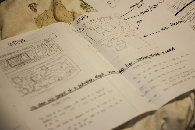
For this reason I measured all of the edges of the designated envelope size to make sure mine was accurate to description. And then began sketching ideas for a few hours. My favourite after all of them was the first which consisted of a keyboard theme, the front of the envelope being the face of a keyboard and the back being the insides with all of the sensors and wires.


To develop the idea I had I made a planning sheet with all my ideas illustrated and written all over the place to give me a feel of whether it was going to work or not and then if it did, work towards that as my aim.


I was more than happy with my idea and how it developed into a double sided mail-shot and communicated what I wanted it to, I then started to work on it digitally.

The longest process of this whole brief was drawing the keyboard, inside and out. I had no idea about how much detail there was to include in the outline illustration of this piece, but now I do. The inside was the hardest because of how many layers of drawing there were to include in it.


After that was finished, I started on the colouring, which yet again seemed very simple and easy to do at first, but I had no idea how many layers of colour in the same opacity I needed to include.


The blue was then slowly added into the bottom of the keyboard and then I I laid all of the letters on the keys in helvetica to keep it simple and legible. Instead of the command 'F' keys at the top like a normal keybaord I displayed the words 'STOP IT NOW' to present an impacting message in a subtle format.


Background colour was added as well as stamp positioning and address box to display the recipients information. I then got some feedback from my peers that the message was too subtle to even notice so I displayed the words 'Trolling and Cyberbullying needs to stop' just above it as if it was the brand of the keyboard, this then helps the eyes follow the message below it.


Here we have the finished image of the outside of my envelope which would be folded in half and then stuck together after being printed digitally onto a light card.


My next task was to make the opposite side of the mail-shot, aka the inside which will inform and advise by following my planning sheet. I used the header type from my posters but changed the words into "How can you stop a troll?" to relate to my current task.


Next was to lay out the text I had planned out including an introduction/explanation of the mail-shot and then on the right side, some contact information to help people who were suffering with cyber-bullying or victimisation by internet trolls.


An interesting idea I had when sketching my planning sheet was to display a skull in the inside of the envelope, i feared it might be a bit too subtle and confusing what the message was but I went with it anyway. This represented the death/end of trolling or cyber-bullying.


Within the skull, I laid my body copy of advice into the shape of the illustration just to make things a little different and make it memorable.


The last thing I had to design was the mailing list which I already roughly knew how I wanted to display it. I decided that I'd be sending this to educational institutions in the area as I was targeting students and children who might be suffering from cyber-bullying.

My list of institutions consisted of:

Leeds College of Art
University Of Leeds
Leeds Metropolitan University
Leeds City College
Allerton High School

I researched their addresses and noted them down for when I needed them in the design process, in the mean time I got started on the design of the List.


After titling the page for my mailing list I boxed it out to help with layout and be visually aesthetic in composition.


Each contact was laid out in the same way, Script header font, and then a block impact type to both identify the institution and present the address.


This layout was followed through with the rest of the institutions and then divided by a single line between the identity and the address. Apart from that I set out an introduction to my mailing list just below the title to make things clear.


After everything was finished and it came to printing and creation I ran into some obstacles. Firstly, I had to cut everything down to size myself because of lack of shaped stock, this made things slightly inaccurate but I managed to fix it all to work within the print format needed.

Next was the stock I chose, I had about ten minutes in the college shop thinking about what kind of stock to use for print and I came to the conclusion that watercolour paper was a fantastic idea because of the texture. Little did I know that the print surface was too rough to stand a decent quality.

Another problem I came to was after printing the double sided mail shots that it wouldn't print directly in line and it was unavoidable that clipping would happen


Overall I was very happy with the results I was left with for this delivery brief. Everything worked together as a set in my eyes and the use of type was followed throughout it to link it together with my three posters as well. If I had the time I would experiment a bit more with the stock I used to find out what would produce the best results.


Crit

For our crit on this brief, we were put into pairs and had about 20 minutes to discuss peoples work on a different table to our own and deliver some feedback to help them understand mistakes and point them in the right direction to change things if needed.


  For my first form of feedback, the pair that evaluated my work told me that the title is clear however the writing inside wasn't very legible because of the bad print and the use of black on blue. However they did know what the mail shot was about.
They didn't understand the skull reference but they thought the use of language was ideal for my target audience.
They told me the brief has been met and the dimensions of the envelope were fitted.
When asked if the mailing list was graphically and visually appropriate they said its easy to read, an effective layout and it looks like its been screen printed, however they didn't think the colours were consistent with the envelope. The purpose and intentions were achieved though.
Everything they said finally was very positive apart from their justified opinion on the black text on blue background.


My second form of feedback was very to the point and helpful.
Their first comment was the concept of trolling isn't really clear as some people don't know what trolling is so i should of made it clear by saying "internet troll".  I responded with the appropriate tone  but the point size and print quality made it hard to read. the mailing list works better than the mail shot because of its clarity and white type. the purpose is understood and immediately recognisable for schools and educational institutions as a whole. 

Both forms of feedback advise i use a different stock, flip the inside the other way round as when it is opened it is upside down, and change the point size and type colour on the inside of the mail-shot to suit the mailing list better.

If I had more time on this brief, I'd use a wider range of stock to experiment with and find the best solution which doesn't effect quality of print or material, and I'd also change the point size and type colour on the inside of the envelope.

OUGD404 - Typeface Families - Design Principles.

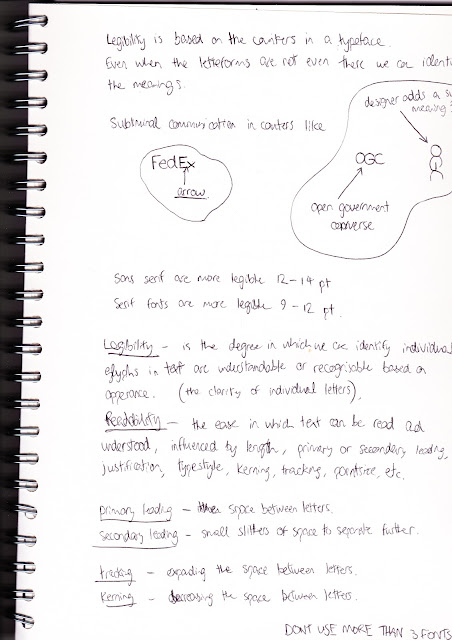
In our context of practice session we were asked to identify the full typeface of all five fonts we chose for last session, to do this I used identifont and then laid out my sheets for the session.


The full typeface for Zapfino was the following: Zapfino, Linotype Zapfino one and Linotype Zapfino two. The family of three are all very similar, however the easiest to read was the standard 'Zapfino' font.


Next I found the full font family for Lucida Blackletter which consisted of only Lucida Blackletter and EF Lucida Blackletter T. The difference between them is so minimal I think it is only the point size scale. I researched and couldn't find anything else anywhere.


Here we have the typeface group of Orator, containign the fonts Orator, Orator 10, MN Orator (monotype), Orator (Mecanorma) and Orator 15. They are all extremely similar but they divide into two groups of serif and sans serif, the sans serif being easier to read.


Next it was the Gloucester family - Gloucester Extra Condensed Bold, Gloucester Condensed Bold, Gloucester Bold, Gloucester Old Style and Gloucester Extended Bold, the biggest family of type I had investigated, after really inspecting all of them I came to the conclusion that Gloucester Extra Condensed Bold was the easiest to read and work with.


The last type family I needed to investigate was the Caslon group - Caslon 3, Adobe Caslon, ITC Caslon 224, ITC Caslon 224 Black, ITC Caslon 224 Black Italic, Caslon 540, Caslon Black, Adobe Caslon Bold, Caslon Bold, Caslon Classico, Caslon Graphique, EF Caslon Graphique, ITC Caslon No. 224 Caslon Old Face and Williams Caslon Text. A massive family of different typefaces all designed by William Caslon in the same style. The most readable out of all of the fonts above was the Adobe Caslon due to the thin but flowing scales of the letters. 


OUGD404 - The Anatomy of Type - Part 3


OUGD404 - The Anatomy of Type - Part 1

Out of the collection of typefaces that were given to me I chose the first as it stood out the best. I also recognised it from somewhere but couldnt quite figure it out.

I went on identifont.com as suggested by Fred and began answering the questions:

 First it asked whether the font was a serif or san-serif font. I think this question was asked first because it is the main division between fonts whether they contain a serif or not, after that, it can then be concentrated down even more by characteristics of the letterforms.                               The second question began the characteristic questions, this one asking about the Q's tail.
The questions got more and more specific to the parts of letterforms until I finally got to the end.

The typeface I had been looking at was a default font on most computers 'Century Gothic'. After identifying what font I was looking at, I started researching what it was about.


It was designed by the Monotype Staff who also designed viral fonts such as Rockwell, Baskerville, Old English and many more.

This font was originally created in 1991 but has been updated twice since in 1995 and 2007.

The font costs between $29 and $284 depending on the package needed but is included in the purchase of Microsoft office for both windows and mac.

Wikipedia: 
Century Gothic is a geometric sans-serif typeface designed for Monotype Imaging in 1991. It is a digital typeface that has never been made into actual foundry type. Century Gothic takes inspiration from Sol Hess's Twentieth Century, which was drawn between 1937 and 1947 for the Lanston Monotype Company as a version of the successful Futura typeface, but with a larger x-height and more even stroke width. The Century Gothic face is distinct for its single-storey lowercase a and g. Century Gothic is more closely related to Avant Garde Gothic, designed by Herb Lubalin, and released by the International Typeface Corporation (ITC) in 1970. Century Gothic is similar to ITC Avant Garde in its pure geometry, and does not possess the subtle variation in stroke width found in either Futura or Twentieth Century. However, it differs from ITC Avant Garde in that Century Gothic does not have a descender on lowercase u (making it appear like a Greekupsilon υ), whereas Avant Garde does. Century Gothic also has larger, rounder tittles on the letters i and j, whereas Avant Garde keeps the tittles square and the same width as the letter strokes.


According to the University of Wisconsin-Green Bay, Century Gothic uses much less ink, saving money on printer ink. They reportedly switched their default e-mail and printing font from Arial to Century Gothic because it uses about 30% less ink.[1]
However, the font is also reported to use more paper (since its letters are wider), meaning that the savings on ink are offset by an increase in paper costs.

  • Century Gothic is the standard title font in Key Club publications.
  • Century Gothic was heavily used in the standing sets of Star Trek: Enterprise as part of the Starfleet standards for that television series' stated time period of the 2150s.
  • Century Gothic is the main font of EA's third-person shooter, Battlefield Heroes.
  • Century Gothic is the main font for the logo of GMA Network.
  • Century Gothic has been used briefly throughout the Jak and Daxter video game series.
  • Century Gothic has been used for the beginning and end credits in the US television series House.
  • Century Gothic with all caps is the font used in the logo of the Australian Association Football club Western Sydney Wanderers FC.
  • Century Gothic is used during the opening titles and the credits of The Hunger Games (film).
  • Century Gothic is the default font on the 2012 Summer Olympic Games medallions.
  • Century Gothic is the font of the band Franz Ferdinand's logo.


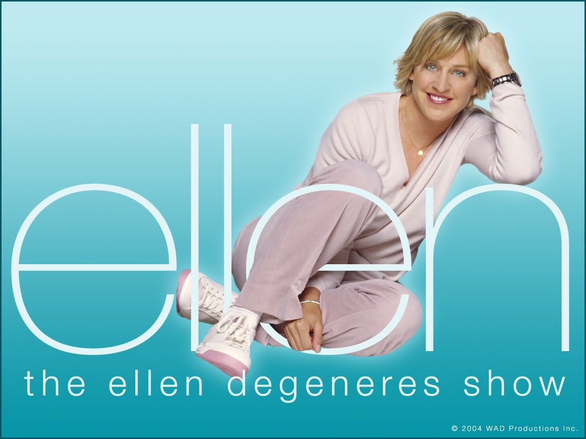
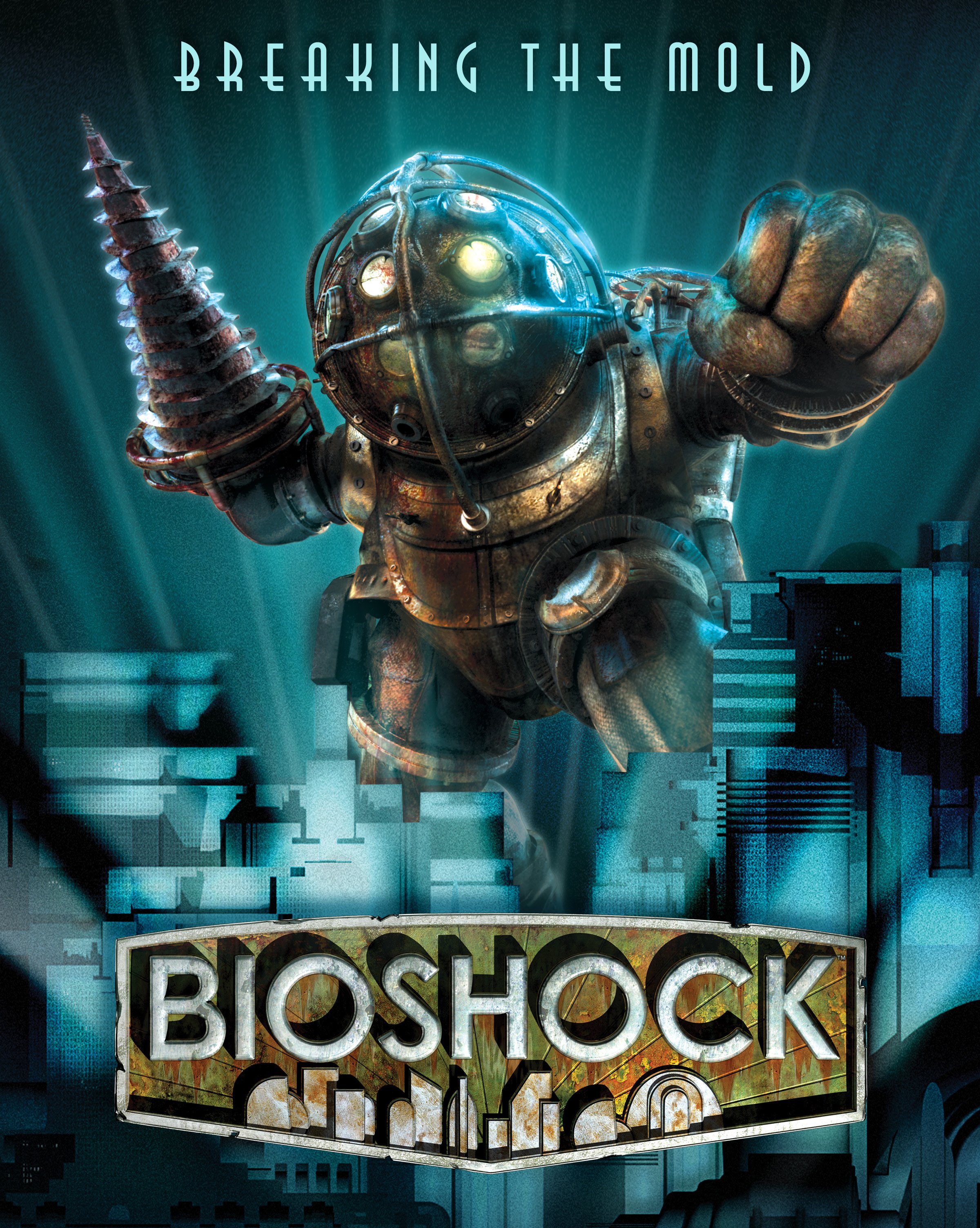
Other examples of Century Gothic i found/remembered are the following:


Copyright 2010. All rights reserved.