For three products I would need to provide three different varieties of beer, a different and peculiar themed one and two more recognisable beers that have different tastes.
Banana Beer.
Banana beer is made from ripe (but not over-ripe) East African Highland bananas.[5] To accelerate the ripening of bananas, a hole is dug in the ground, lined with dried banana leaves which are then set on fire. Fresh banana leaves are laid on top of them, and then the unripe bananas. These are then covered by more fresh banana leaves and pseudostems. After four to six days, the bananas are ripe enough.[1] This method only works in the dry season. During the rainy season, bananas are ripened by putting them on a hurdle near a cooking fire.[6]
There are two types of banana that are used for banana beer: the harsh tasting igikashi and the milder tasting igisahira.[7] The banana beer mixture consists of one third igikashi and two thirdsigisahira. Once ripened, the bananas are peeled. If they cannot be peeled by hand, they are not ripe enough. After peeling, the bananas are kneaded until soft. The juice is then filtered to get clear banana juice, which is then diluted with water. Sorghum is ground and lightly roasted and then added to the juice. This mixture is left to ferment for 24 hours and then filtered. (Wikipedia)
Golden Ale.
Developed in hope of winning the younger people away from drinking lager in favour of cask ales. In a way quite similar to pale ale yet there are some notable differences- it is paler, brewed with lager or low temperature ale malts and they are served in colder temperatures. The strength of Golden ales varies from 3.5% to 5.3%. (Wikipedia)
Pale Ale.
Pale ale was a term used for beers made from malt dried with coke. Coke had been first used for roasting malt in 1642, but it wasn't until around 1703 that the term pale ale was first used[citation needed]. By 1784 advertisements were appearing in the Calcutta Gazette for "light and excellent" pale ale[citation needed]. By 1830 onward the expressions bitter and pale ale were synonymous.[citation needed]. Breweries would tend to designate beers as pale ale, though customers would commonly refer to the same beers as bitter. It is thought that customers used the term bitter to differentiate these pale ales from other less noticeably hopped beers such as porter and mild. By the mid to late 20th century, while brewers were still labelling bottled beers as pale ale, they had begun identifying cask beers as bitter, except those from Burton on Trent, which tend to be referred to as pale ales regardless of the method of dispatch. (Wikipedia)
These will be interesting to design for as I have always admired artisan beers and their packaging. This will also strengthen my branding as my logo and type considerations must remain intact.
My idea was to create a centre aligned layout that was framed by left aligned information. This balanced out the content and also played a good role in the hierarchy of information giving the entity to the name of the beer and an illustration, surrounding it with important information and then less important information.


To produce these beers, I merrily went to the local shop and bought three beautiful craft beers which I enjoyed whilst doing some other work before boiling the labels off of the bottles and then spray mounting my own labels printed on a thick uncoated cartridge stock. The result was a beautiful end product which should look great in the photos.
The next production fast was the apron. Being either stupid or just determined, I decided to print the bicycle pattern over the pocket and print the logo above it. This meant masking off a large area around the pocket before screen printing it. I was very happy to see it work perfectly with only small bits reaching past it.


For tapas, meats and cheeses, I wanted to produce a wooden board to serve them upon. To do this I bought a hand carved olive wood board and laser engraved the bicycle pattern over it. I first tested both outlines and rasterisation on a piece of MDF and decided rasterisation would be the best to go for as it left a nice effect in the fill.


I was very happy with the turnout as the edges of the board were curved, this made the laser blur out the image along the sides as if it was melted into the wood, a really nice effect and the perfect addition to branding the food served at the cafe.

Packaging the food for take away was something I wanted to have a go at because of my lack of experience in package design. I first drew out a net design for the packaging of pastas, salads and fruit with all the expected measurements and then cut this out of some Kraft card to fit with the ethical and recycled theme running throughout the branding. Considerations I took were two separate compartments for cutlery and napkins as well as the food compartment.


The one thing I learned after completing the net and building it was I needed some support where the divider was as this easily bent out of shape. This was amended and the design worked perfectly.


The next part was the sliding cover to protect the food. This would have a little window so customers could see the food and be sure they'd want it, this would also encourage them to buy it because of how good it looked.


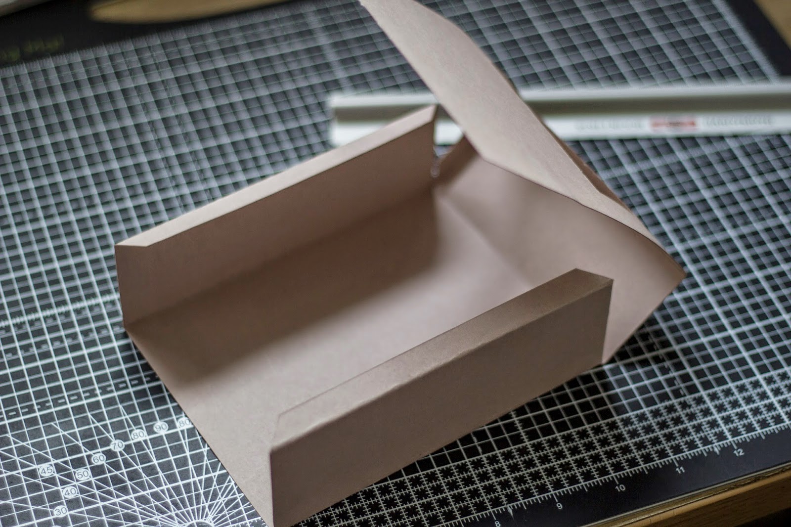


It all fit perfectly as I gave a little room on top and on the side for the box to slide in and out with no issues. However this was soon ruined as even though it was a good fit, it was difficult to get the box out because of the friction against the rough stock. I came up with a fix to this by cutting some gaps on the sides to pull it out width-ways. When designing the imagery on the packing I must remember to create some info graphics to advise how to open easily.


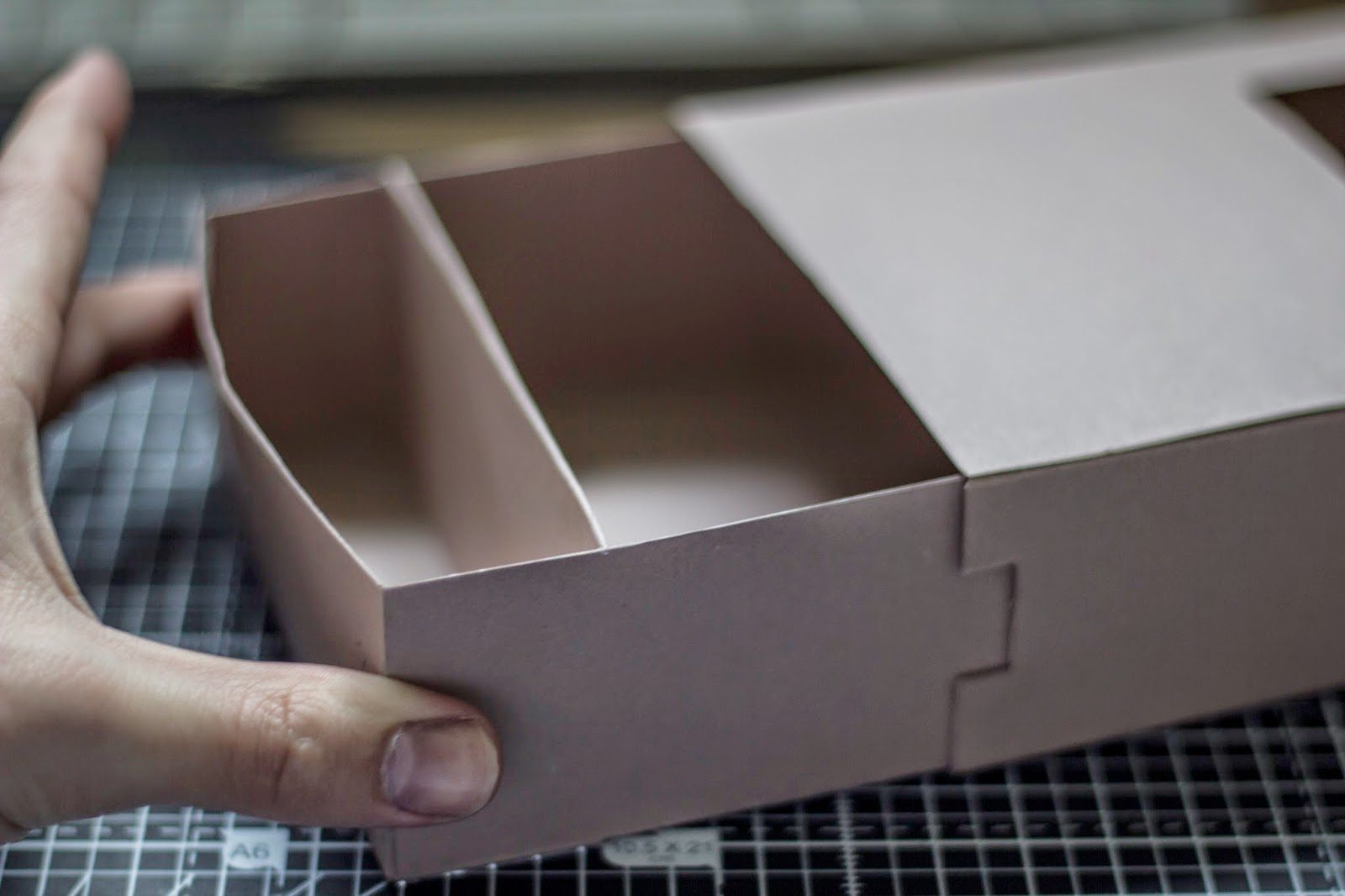
To seal the box, I had some sticker paper and so I stamped it with the logo and then used a scalpel to cut a rectangle out. This would work very well in a real life situation as it would be cheap and reliable.

I went to the shops and bought napkins, a clip-top jar, greaseproof paper, and coffee beans. All but the coffee beans were part of the branding elements I needed, those were for the photoshoot.
The napkins would be stamped and put in the box along with some disposable cutlery.

I had an idea about branding the plates and bowls, rather than just putting the logo on, which I was told looked very clean unlike the texturised logo and stamp aesthetics. The indent of the plates and bowl is circular, and when thinking of circular objects which are relevant I remembered a bicycle's wheel is round.
Now because my style is so minimal there are no spokes and sprockets in the wheel, which would just make it look like a couple of circles (the detail wouldn't be able to be vinyl cut anyway). I thought of having a circular cut out of the bicycle icon with the back wheel in the exact centre of the plate. This made an interesting composition I was really happy with as it stopped looking like I was just sticking the logo on everything.

For the coffee mug and the pint glass, I wanted something that would make people laugh and probably encourage clients to buy another after. Puns are probably the most annoyingly funny thing around so maybe using a pun on each would be good, that way a different one could be on each glass making people laugh time and time again (as they get more drunk too sometimes).
Only having one mug and one glass made me know I needed to use the best one I could think of or find.
I decided on 'A Whole Latte Love' for the latte glass, and 'Ales Well That Ends Well'. This would work well in the header font I use.


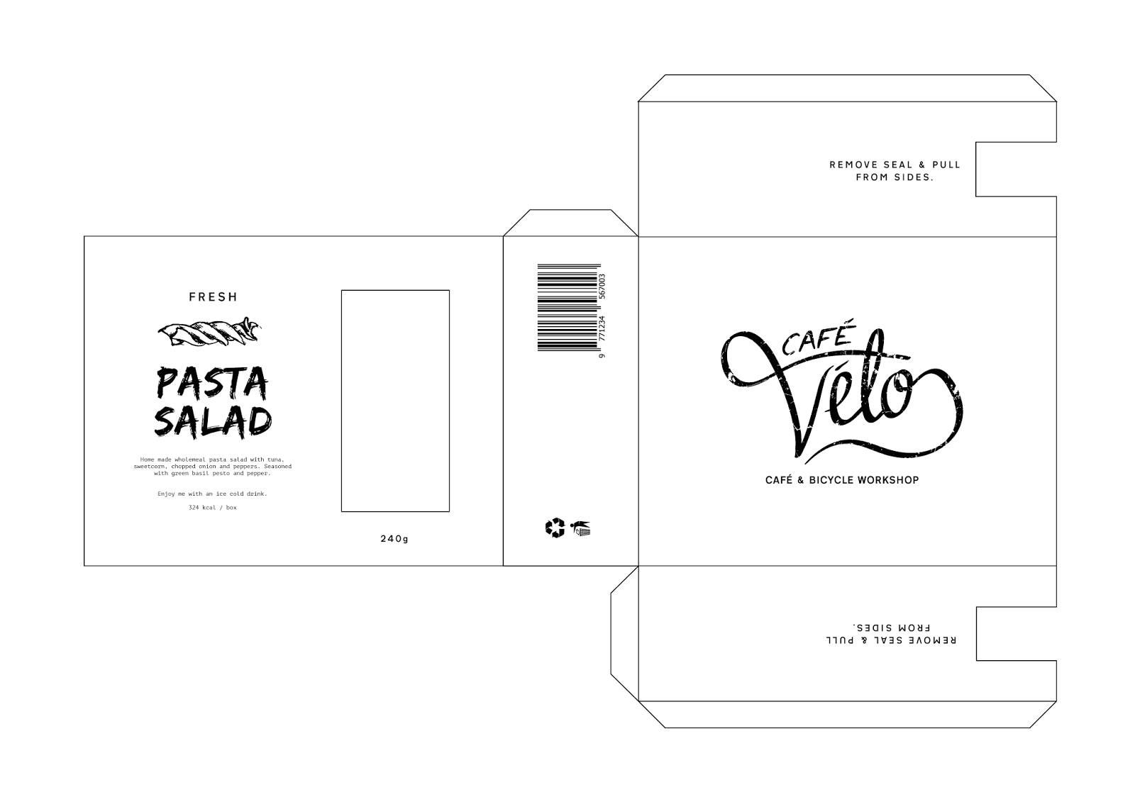
One of the final elements that needed to be completed was the take-away food packaging. I had already designed the net and just needed to design something to screen print onto the box such as ingredients, description, name, illustration, etc. I am going to follow the design of the beer bottle as a base to go off and then alter them for each content.


Leave your comment