Brief Analysis:
Why have you chosen the brief?
I am yet to experience a packaging design brief for an already existing product which has values and ethics behind it. I enjoy the drink myself and it'd be a good place to start taking in consideration it's restrictions and limits.
What do you want to get out of the brief?
I want to win and gain recognition, confidence, reputation and satisfaction from my work at the same time as learning more about packaging design through the research, development and execution of my response.
What do you want to do/make/propose in response to the brief?
I would like to bring something different to the table for Purdey's, I want to design a container for the health drink which would make it stand out on shelves, attract people to the product and define what the drink's values and contents are visually to give their audience a bigger inclination towards it rather than it's competitors.
What do you need to do/make/propose?
A recognisable, different approach to packaging a product which works as a health benefit to consumers. This needs to push the boundaries of what we know as energy/health products and put it to the forefront of it's competitors.
After I answered my questions about the brief I rewrote it to focus my direction better than in the actual brief's format.
I then went on to mind-map ideas and plans to channel my thoughts better, this also helped develop those plans into something better.
After building on concept development I sketched out different bottle shapes and sizes.
To figure out to myself what a person would feel when drinking their product I wrote a list of words down as I drank a bottle myself to put down everything.
Fruity, energy, awake, rejuvenated, healthy, good, kind, thirst, natural, revitalising, senses, chilled.
Including these words would engage a connection between a person's natural senses and the product. My favourite words were good, kind, fruity, and revitalising.
I drew out some bottle templates and quickly jotted out layout ideas to start my development. I wasn't sure if imagery would be used yet so I kept to type only.
After my first six sketches, I realised how much impact type alone could have on the bottle. By capturing the right feelings, thoughts and triggering the consumers subconscious I could make the bottle far more appealing mentally which would help towards a success.
I thought of the phrase "Rejuvenate: Your mind, your day, your life, your family, friends, the world around you. Feel Good. Feel Right" I don't know where it came from but it came to me whilst I was drinking it and it felt like I had defined the whole concept of the drink benefitting the consumer's state of mind, how they'd feel that day, how it'd benefit their day-to-day life, how that would then make positive things happen with the person's state of mind, and then how it will also benefit the world around them because of their uplifted mood and also because the bottle is 100% recyclable and eco-friendly. Finally hitting home by telling the consumer to feel good, and that is how they should feel.
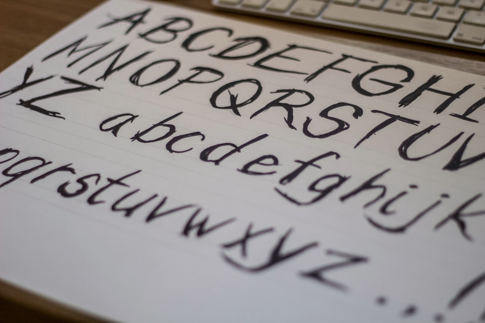
I felt like this message required an energetic, artistic typeface that spoke the message visually to set the tone and gather the interest for them to read it.
To deal with this I decided to make my own typeface to null out copyright problems, which I did by hand.
I then laid it all out to what I imagined and changed it once to feel entirely confident with it.
After I was happy with the layout I added the nutritional information and intro of the drink around it.
As I had limited time until our crit, I decided to keep the Natural Energy version the same but with different description and different colour even though the type and words would change. This way I could show the colour and consistency in style even though it'd be slightly different when submitted.
Now I had two labels to show, I also needed to put it into context and mock it up as if it was a real object.
I found this really difficult as I had designed the shape of the bottle too, this kind of put it into context but not very well.


Leave your comment