My concept is to develop a publication aimed at the new students of our course in
September to entertain and humour them but at the same time, remind them some important concepts of Graphic Design which people shouldn't do; Such as common mistakes and annoying and generically bad things some designers do.
Each double page spread of the book will have informative and humorous body copy supported by an illustration. It will be useful to refer to during briefs for the first year designers for both guidance, advice and a laugh.
I am doing this because when I started, I wasn’t very knowledgeable on Graphic Design and also had the worries on my mind of making friends and keeping on top of things. Having something to guide me away from designer’s mistakes would of been helpful and appreciated by me in particular.

Method Of Delivery:
I want the publication to be very professional but also humorous.
Instead of creating something under a handmade aesthetic, I want to make it very clean and would rather put production in the hands of a professional with better facilities so I can focus on the design aspects of the project as well as the content as a whole.
This publication can be given out to first years when they begin the course and will serve them usefully throughout the induction stages and the remainder of the program.

Production:
I will get the book externally made in a format of 5"x 8" as I think this is a nicely ideal 'pocket size' book for ease of students carrying around.
Stock would be a nicely usable soft cover with gloss finish interiors.
Printing will be based in four colour process CMYK on both cover and interiors for use of illustration and text.
Ideally speaking I'd get one made for each student but I wouldn't be able to afford that, therefore it would have to be a small selection if more than one.

My crit was very useful and guided me in the right direction for the brief with helpful tips and feedback which I appreciated.
Feedback that I wanted to particularly take note of were the following:
- Make sure that everything is organised into either sections or chapters for easy readability.
- Try including a time-table pull out to help manage the audience's time better.
- Include useful websites such as design blogs and other creative websites.
- Make sure the research and body content is collected from a variety of trusted sources in experience and professionalism.
- Make sure it's light hearted, you don't want to scare them.
- Maybe concentrate on the technical aspects of Graphic Design rather than aesthetics.
After reflecting on my feedback, design sheets and presentation I recognised that I needed to make changes to my project to make it successful.
The idea of concentrating on technical aspects which could help guide the newcomers before they are taught it in detail appeals to me more than concentrating on aesthetics, seeing as that is down to opinion and the technical aspects can not be argued.
Focusing on the brief title 'Speaking From Experience' I am thinking of completing this with a hand rendered aesthetic, as if a student has literally written it all down inside a notebook. With this in mind, I also need to think about production and how I want it printed.


When writing out the body copy, I realised that the aesthetics I was following weren't working for me. I wasn't enjoying what I was doing and it just didn't look good.

So yet again, I decided to change styles. I started my planning again in the form of layout and design sheets:


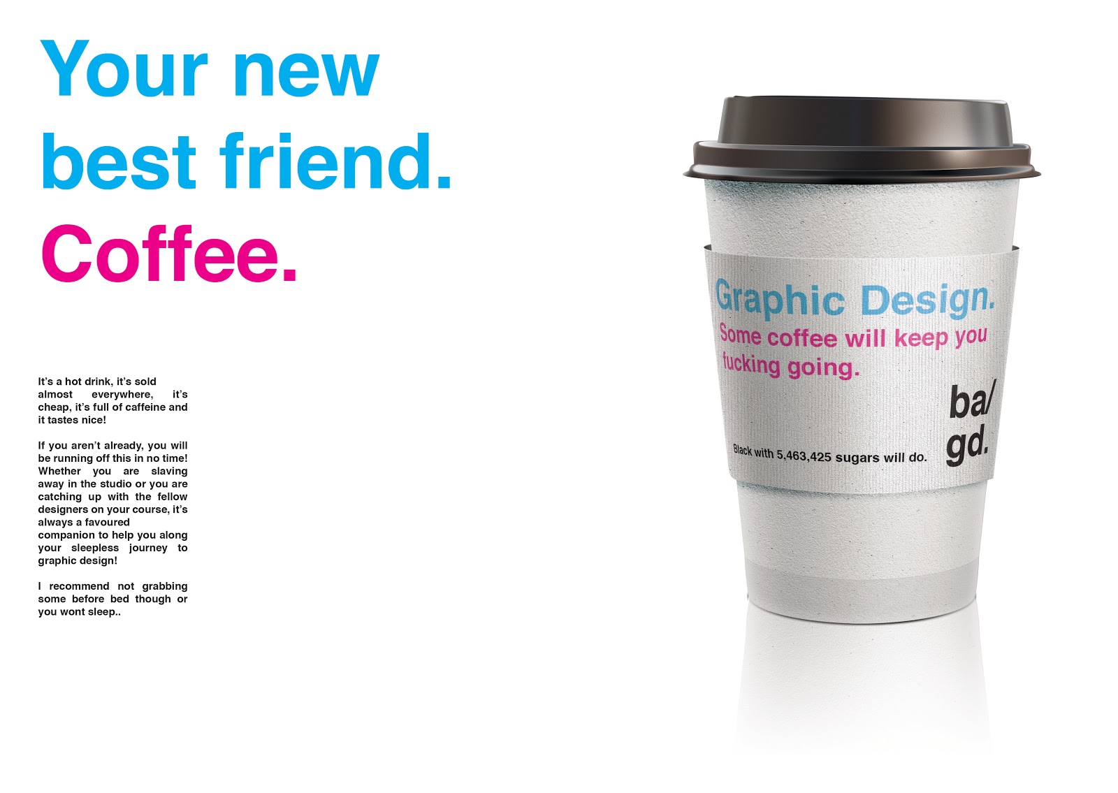
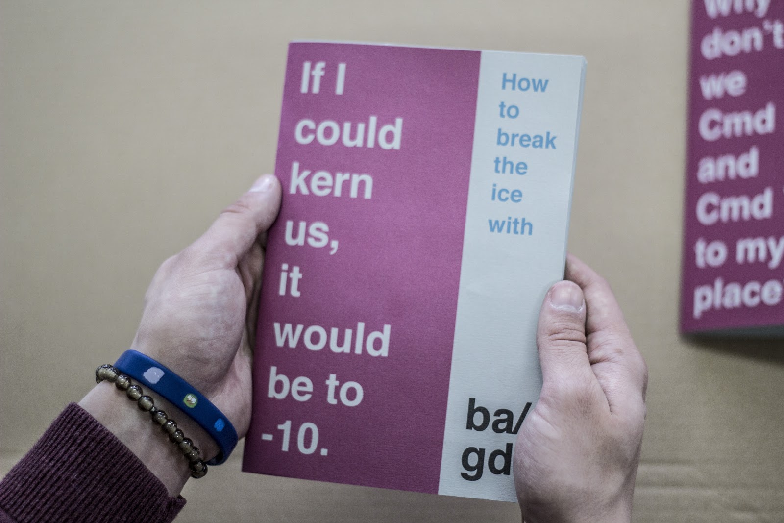
I came up with what seemed like a very enjoyable concept with humour, modern aesthetics, a clean and consistent colour scheme and style.
The concept was breaking the ice with our course and this lead me to use graphic design pick up lines. After I got some written down I pictured how I wanted to cover and wanted the rest of the content to follow it's aesthetics.
After sketching out my layout idea I put it into motion to see it finished and digital.


I really like how these turned out, they give quite a welcoming feeling both the colour scheme and tone of voice. I have never done anything with these aesthetics before so I was very happy with this.


I was suggested to bound it with staples as there wasn't too many pages and it would fit with the modern aesthetics. I was also told to make sure the point size was appropriate to the stock I used as the body content is very small. Other feedback I received was to include more illustrations to make the overall content work consistently.


I bought some stock from the library to try a variety and then I printed the front cover and the first spread on each one to look over what effect I would prefer.
Because of the colours I chose, the off-white and the white stock inflicted a lot of contrast with the work and it became harder to read the body copy. With Pearl grey paper, there was less contrast, so was easier on the eyes.
I decided to use pearl grey stock for both my cover and my content.
After reflecting on my feedback I realised I didn't really like the idea of putting a full on portrait of myself in the book, it felt a bit wrong so I changed the idea and added more photography to the rest of the layouts to make it work a lot more consistently.


 After finishing these layouts, I asked for feedback off people again and everyone said it was a massive improvement and the first years would find it very useful and inspiring.
To put it into production I got it all printed in the digital dungeon and then bound it by stapling the body copy and then spray mounting the front cover onto it.
This worked very well as it provided a clean and modern bound without showing the staples on the front of the book. This gave a more professional aesthetic to it without doing a full thread bind.


I was really happy with how my book turned out and I am looking forward to giving it to the first years, I hope they find it useful.
If I could go back and re-do it or have more time, I would actually experiment with book binding because looking at it now, I think a very fine thread would work fine with the aesthetics even though my feedback said the opposite.
Because of the colours I chose, the off-white and the white stock inflicted a lot of contrast with the work and it became harder to read the body copy. With Pearl grey paper, there was less contrast, so was easier on the eyes.
I decided to use pearl grey stock for both my cover and my content.
After reflecting on my feedback I realised I didn't really like the idea of putting a full on portrait of myself in the book, it felt a bit wrong so I changed the idea and added more photography to the rest of the layouts to make it work a lot more consistently.


To put it into production I got it all printed in the digital dungeon and then bound it by stapling the body copy and then spray mounting the front cover onto it.
This worked very well as it provided a clean and modern bound without showing the staples on the front of the book. This gave a more professional aesthetic to it without doing a full thread bind.


If I could go back and re-do it or have more time, I would actually experiment with book binding because looking at it now, I think a very fine thread would work fine with the aesthetics even though my feedback said the opposite.
Leave your comment