Semiotics:
Metaphors, Metonyms and Synecdoches.
Visual Synecdoche - applied when a part is used to represent the whole, or vice versa.
Visual Metonym - a symbolic image that is used to make reference to something with a more literal meaning. Similar to a synecdoche but with no direct connection.
"In trying to separate words from pictures we have to accept that words are 'pictures of letters'" - David Crow
To begin our exercise, we were asked to get out the words we were asked to print off and cut out for this session. I laid all of the words onto the table appropriate to weight and point-size.

After laying them out on the table, we were told to mix them all up so they were no longer in order and each sentence consisted of different weights.

Then the embarrassing part happened and we were told to read our sentences in response to the weight of each word. Lots of whispering and combined shouting came of this to help us understand the dynamic range of communication just in weights.

Finally we were asked to mix them up again but this time changing the point-sizes as well. The same verbal exercise followed but this time the variations of pitches and tones were even more recognisable.

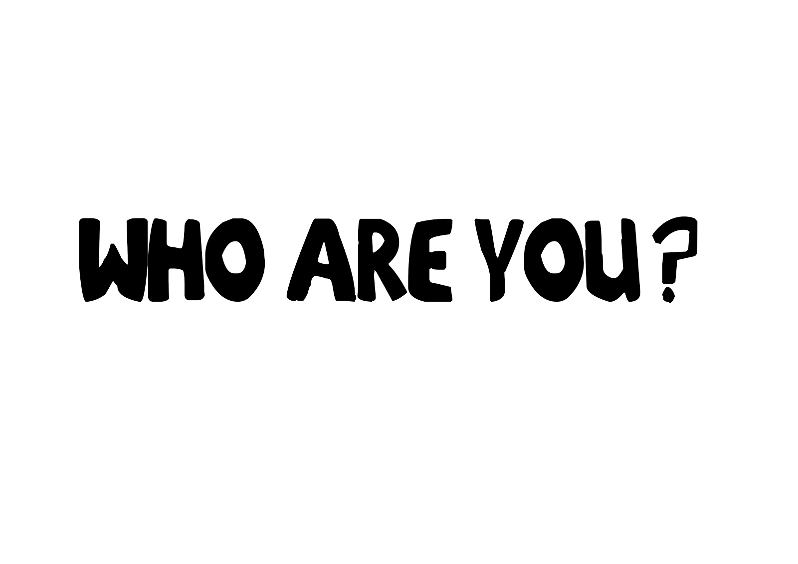
Our homework from this session was to explore the concept of accents through type. We had to deliver ten variations of the sentence "Who are you?" in a variety of different fonts to represent the designated accents.
The accents we had to represent were:
Scottish, South African, Italian, Texan, Mexican, Somerset, Birmingham, Cockney, German, Chinese, and Swedish.
Birmingham: Liberator

Chinese: Chinese Takeaway


In this design principles session we came together with all of our "who are you?" typefaces representing the accents of different places.
This was a really funny session where we could compare the different typefaces we used to represent different accents, lots were very stereotypical especially mexican, chinese and texan as well as others.
We laid them all out in groups which we created and moved to the next table where we would then judge which types represented which accents. We were also asked to take notes on what defined the typefaces of each accent:

After we did this, we all moved back to our tables to see what they judged our types into.

We weren't very surprised to see that a lot of them were very hard to distinguish between the different accents, however all of mine were categorised in the right places apart from Birmingham and Somerset. This was a really interesting exercise where we learned about the different backgrounds of type and how people distinguish them.

After we had finished with this exercise, we were told to come up with a group name and create teams of 3-4 people. I got into a team with Danielle Harrison and Sarah Goldthorpe with Team Typogotit. We were then told we would be competing with the other teams in the class in a pub quiz - just without the pub.
This was a quiz based on the module and everything we had learned like a school end of unit test. Out of all of the groups, we came first with 18/20 in the final score with second place hitting 15/20 and last place hitting 11/20, each member of our group were awarded with a bendy curve ruler to help with creating letterforms - fantastic prize.
Leave your comment