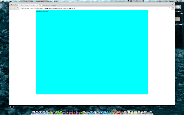
After that was ready I created my root folder and started with the building of my homepage with html and css. I used bright colours in my css so I could make sure everything was right in size and proportions. This will be changed later on.
Next was to put the logo into the mix above the nag bar and in the centre of the page. One of the problems I came across was the logo overlapping the nag bar, I sat and tried overcoming it with css for a while with Phil but ended up giving up and putting a massive group of line breaks instead which worked.
Next I made the buttons for each of the pages I was going to include on my website. To do this I made the buttons on illustrator in a 256 x 50 px canvas by creating two images of each piece of type, one underlined and one not.
Then in dreamweaver I used what we learned in our web induction to create a rollover link with the two images I made.
This was then repeated for each button. However somehow it turned out like this:
This was fixed by making the button css float left.
For the slider, I found a site which helped create the fundamental coding so I went from this and changed it to my requirements.
After customising the options to my requirements I embedded this into the html too. This was being a pain with aligning it to the centre so I threw a load of elements into the beginning of the code.


Leave your comment