Presentation
Our perception of colour is all based on our physiological ability to observe wave lengths.
Because of this physiological response, the eye can be "fooled" into seeing the full range of visible colour through the proportionate adjustment of just three colours: red, green and blue.
Colour is based on an interpretation of contrast.
All contrasts are happening at the same time.
Itten's 7 contrasts
- Contrast of tone
Formed by the juxtaposition of light and dark values. This could be monochromatic (single colour)
Removed all colour values to make the colour wheel monochrome - This suggests that even without the chromatic value we can perceive difference based on tone.
The highest contrast we can see is black and white.
White word on grey background and black word on grey background both just as readable because they are on a mid tone.
When similar tones are used it is harder to read.
Orange on the red are almost the same distance apart. They start to blend together.
Blue on red is a higher contrast making the blue become thrown forward.
- Contrast of hue
Formed by the juxtaposing of different hues. The greater the distance between hues on a colour wheel, the greater the contrast.
Blue, yellow and red have an equal distance between them. In terms of hue there is an equal distance between them.
Yellow is the brightest colour but blue is the one that stands out the most.
The closer to black there are the less contrast there is. Yellow comes forward as there is the contrast of tone and hue working together.
You have to consider which background colour to use to produce the most contrast.
There is a real active contrast between the lightest and the darkest colour (blue and yellow) they start to merge together once you stare at them for long enough.
White background with yellow type is almost illegible.
Black background with yellow type is the most legible.
Closer in terms of hue to the background makes it less legible.
Low contrast is almost something blending in.
- Contrast of saturation
Formed by the juxtaposition of light and dark values and their relative saturations.
A pure spectral yellow in the middle will make all other yellows look desaturated.
It is cumulative.
Tone, hue and saturation - Fundamental contrasts
- Contrast of extension
Formed by assigning proportional field sizes in relation to the visual weight of a colour. Also known as the contrast of proportion.
Balancing a colour is something we try to achieve.
Proportion and weight of a colour.
Spatial shift - Intense complementary opposites.
Last thing to put together is complementary colours.
- Contrast of temperature
Formed by juxtaposing hues that can also be considered 'warm' or 'cool'. Also known as the contrast of warm and cool.
Red - Cooling temperature moving it more towards another colour.
Black removes gradient making them flat colours.
Changes colour infront of our eyes.
- Complementary contrast
Formed by juxtaposing complementary colours from a colour wheel or perceptual opposites.
Red and green just as high contrast as black and white.
We have no control over complementaries.
Dealing with perceivable colours.
They start to blur and vibrate.
Complementaries start to react with each other.
Green on red - More painful composition.
Brighter higher chromatic colours are even harder to read.
- Simultaneous contrast
Formed when boundaries between colours perceptually vibrate.
Blur and merge.
All contrasts happening simultaneously.
We can't separate complementaries.
Seeing all colours even though one is absent.
Exercise
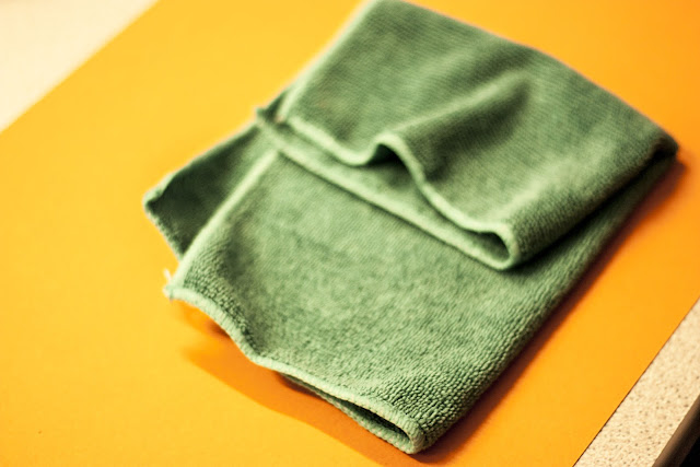
After this presentation we were told to place 5 objects of each colour onto a different colour background to see how the colour changes depending on the background..
We had to choose two complementary colours so me and Danielle chose red and green. Below are the images of the objects we used and then what they look like when placed on top of the different coloured paper.


Leave your comment