In our first design principles session we were given two tasks to complete.
The first was to show 4 images that we'd already come across, two which we loved and two which we couldn't stand.
Like:
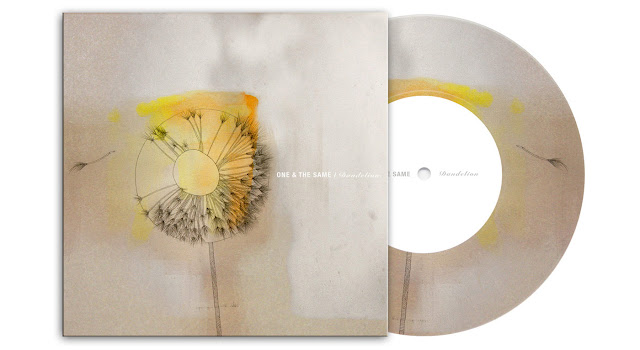
My first example of Graphic Design which I like is some cover art I discovered whilst reading up on Ben-Ashton Bell. The band 'One & The Same' commissioned Ben for this album artwork for their release of 'Dandelion'.
This piece was made a very simple yet profound combination of pencil on stained paper followed by light watercolour for some added character in the dandelion. I absolutely love this piece of work by one of my favourite designers. The effective result of using such traditional mediums of creation contrasted with digital typography really does capture the emotion of the band.
My second example is by designer Fabien Barral, an artist I studied during my A-levels. This idea of a letterpress calendar is so amazing. Using traditional print work he has created these unique calendars displaying inspirational design quotes and fantastic pattern work/typography.
Hate:
At the moment there seems to be a bit of a storm of independent clothing labels arising out of nowhere, some of you will know I run one myself but it was nothing like this. My one started from a college project for my personal investigation unit and it turned into a business from there.
However, something that is really irritating me is the fact all of these people think they are artists/designers because they downloaded a font from dafont.com and put a word on a t-shirt, charging £20 for them. THAT IS NOT HOW IT WORKS. Here are some examples I found after some research and to be honest I am hoping you are sharing the same cringe as me.
 |
| Hype Clothing |
 |
| Spook Apparel |
 |
| Stope Clothing |
 |
| Classe Clothing |
Another piece of graphic design I hate is one of the strongest identities in the world. But surely that makes it great doesn't it? It is recognisable, it is an identity people understand and its a great way of communication. Why is it bad? It just looks awful, the colour scheme, the style, it's modern but its ugly. Its just an opinion of mine, lots of people love it and I can understand that, but I personally think its hideous and if you are going to represent such a huge event like the Olympics, you want it to look professional and clean.


Leave your comment